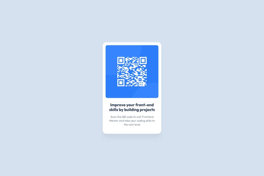
Design comparison
Solution retrospective
I found it difficult to determine the width based on the design I'm still not sure I found the right proportions.
If anyone has any suggestions for best practices I'm all ears!
Community feedback
- @vanzasetiaPosted almost 2 years ago
Hi, Mariana! 👋
It is fine if the card's width is having a bit more width or less width than the original design. It is more important to focus on code quality instead.
Alternative text for the QR code should be human-readable. Also, it should describe about the QR code used for. So, a better alternative text can be "QR code to frontendmentor.io".
Remove
widthandheightfrom the<body>. It should always fill the entire page. Treat it as the main element of the web page.If you ever need to set a height on the
<body>, usemin-heightinstead. It is okay to always setmin-height: 100vhas the initial styling for the<body>.Avoid using
pxunit for font sizes. Useremoreminstead. Relative units such asremandemcan adapt when the users change the browser's font size setting. Learn more — The Surprising Truth About Pixels and Accessibility: should I use pixels or rems?.I hope this helps. Happy coding!
Marked as helpful1@vanzasetiaPosted almost 2 years ago@marianarainha You are welcome! I am glad I could help.
0
Please log in to post a comment
Log in with GitHubJoin our Discord community
Join thousands of Frontend Mentor community members taking the challenges, sharing resources, helping each other, and chatting about all things front-end!
Join our Discord
