Design comparison
Solution retrospective
Which areas of your code are you unsure of?
Shadow size
Community feedback
- @LipAlex1Posted over 2 years ago
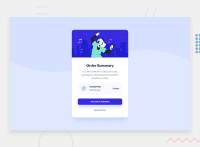
I like the way your card looks!
You may want to take a look at the report as there are 3 ally issues with the code.
There should be only one h1 on a site for SEO reasons; also you should be using semantic html (main, section, article, nav, header, footer etc.).
It is good practice to provide useful content to the alt attribute of images so that screen readers and broken links to images don't cause problems for your users.
Also, I noticed not all the active features are there. According to specs the mouse arrow should turn to a pointer on three occasions.
Keep up the good work and happy coding!
Marked as helpful1 - @shashreesamuelPosted over 2 years ago
Hey good job completing this challenge
Keep up the good work
Your solution looks great however I think that the card needs to be scaled up a little bit using
transform: scale().Secondly I think the color of your button text does not match the color specified in the
style-guide.mdfileI hope this helps
Cheers
Happy coding 👍
Marked as helpful1
Please log in to post a comment
Log in with GitHubJoin our Discord community
Join thousands of Frontend Mentor community members taking the challenges, sharing resources, helping each other, and chatting about all things front-end!
Join our Discord

