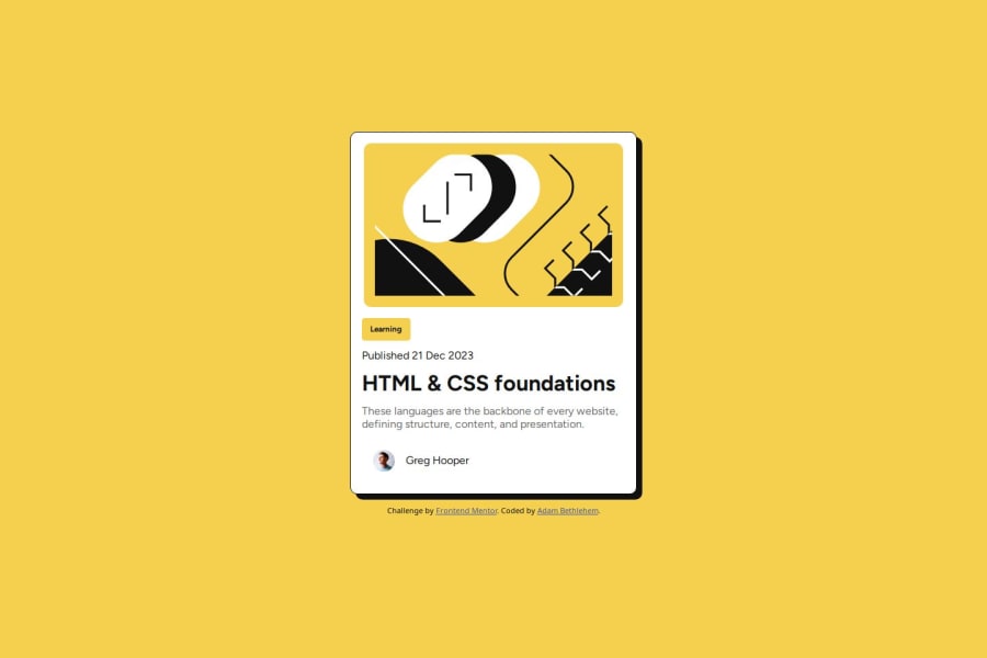


Design comparison

Solution retrospective
I was able to get it pretty close to the original design. I'm sure if I spent another hour or so I could refine it even more.
I was stuck in tutorial hell feeling I had no clue when it comes to CSS, but by actually doing the challenges I'm finding I have learned some techniques and even some theories.
The thing I'm proud of the most is actually starting to do it
What challenges did you encounter, and how did you overcome them?This time I decided to use the Figma designs and it was very helpful, much easier trying the solution from the image
I just found it hard to understand if the figma dev-tools styling was inheriting styles and layout or if all my container elements must be flexboxes
I also tried to stick to the designs as much as possible but some of the values just didn't work for me
What specific areas of your project would you like help with?I still need to better understand what elements need to display: flex;
A part I'm struggling with is defining the height and width... how do you know what units to use? Should I always set height and width?
When do you let the child content determine the layout size?
Community feedback
- @haquanqPosted 9 months ago
Hello Adam,
About your feedback question:
- Most of the time you would like your element's content to determine it's height (not width) and using
min/max-widthto set a boundary for it'swidthon screen size changes. The reason for that is because our device sizes often change it'swidthsize (from mobile to desktop and opposite, phones nowadays are huge and has it's height almost as long as a small laptop) the most and keep the content centered to the middle of the screen. - Depend on the behavior of the app you would like to achieve,
rem/em/pxare always appropriate, maybe you would like you spacings to stay the same thenpxor elserem/em.
About your solution:
- Page must have one
mainlandmark (read more here)) which means wrap the mot important content of the page inside it. - Use more semantic HTML elements such as
article, section, p. For example, you can wrap your content inside asectionorarticleinstead ofdiv(divhas no semantic meaning). - When using headings, never skip any level, always go from
h1-h6and never determine a heading level because of the size on the design (visual can change, the flow of content does not).
Have a nice day!!
Marked as helpful0@haquanqPosted 9 months agohey, forgot about the question when to use
display: flex:display: flexallow you to control the layout of it's child elements (multiple child elements) such as give them even space in between or change their direction.- Property
displayhas several value which affect itself or it's child elements, Kevin Powell on Youtube recently has a nice video about this topic
Marked as helpful0 - Most of the time you would like your element's content to determine it's height (not width) and using

Please log in to post a comment
Log in with GitHub
Join our Discord community
Join thousands of Frontend Mentor community members taking the challenges, sharing resources, helping each other, and chatting about all things front-end!
Join our Discord