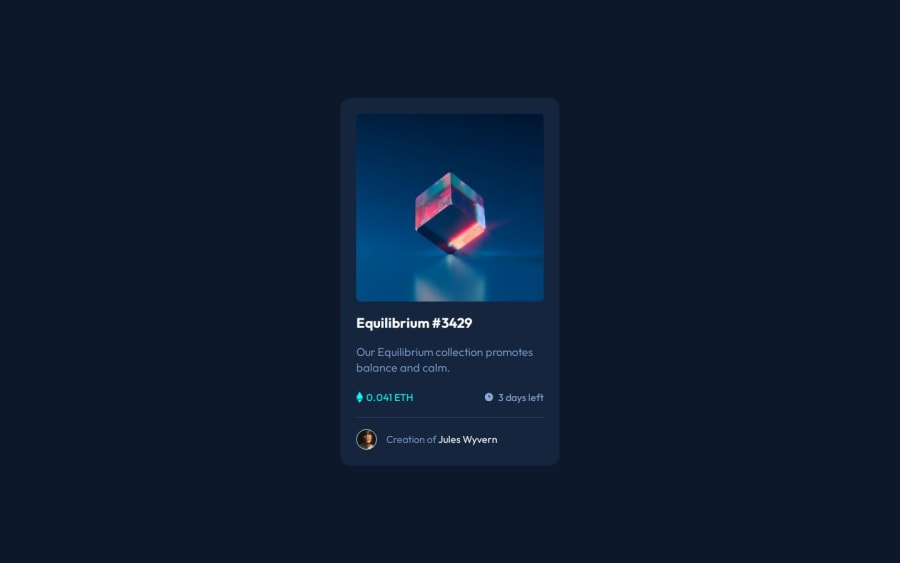
Design comparison
Solution retrospective
The fact that I was able to visualize the main structure of the HTML quite accurately was surprising to me. I think that first drawing on a piece of paper and breaking it down, analyzing what each part would be and what tag to represent each part helped a lot and I will definitely going to do it for future projects. Something I would do differently would be refactoring more the CSS part, without leaving with repeated parts.
What challenges did you encounter, and how did you overcome them?One of the challenges was definitely the sizing, since I only hade a png file to work with, it was suggested that I would use the perfectpixel extension for google chrome. However, my screen resolution was different than the png file, so at first everything was smaller and the font size for the paragraphs suggested for the challenge was way to big for the card. After I realize my screen resolution was different, I was able to fit everything a lot easier.
What specific areas of your project would you like help with?Perhaps with CSS on the should I use padding or margin here, visually the two seems to yield the same result, so I end up not knowing which one to use.
Community feedback
Please log in to post a comment
Log in with GitHubJoin our Discord community
Join thousands of Frontend Mentor community members taking the challenges, sharing resources, helping each other, and chatting about all things front-end!
Join our Discord
