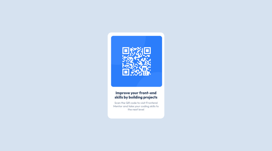
Design comparison
Solution retrospective
How may I improve this code? What did I do incorrectly? What did I do well?
Community feedback
- @correlucasPosted over 2 years ago
👾Hi Justin Alexander, congratulations on your solution!👋 Welcome to the Frontend Mentor Coding Community!
Great solution and a great start! From what I saw you’re on the right track. I’ve few suggestions for you that you can consider adding to your code:
1.Fix the alignment of the whole content using
flexandmin-heightto manage the vertical alignment and make everything centered.First of all putmin-height: 100vhto thebodyto make the body display 100% of the viewport height (this makes the container align to the height size that's now 100% of the screen height) size anddisplay: flexeflex-direction: columnto align the child element (the container) vertically using the body as reference.body { min-height: 100vh; margin: 0; display: flex; align-items: center; justify-content: center; flex-direction: column; }2.Replace the
<h2>containing the main title with<h1>note that this title is the main heading for this page and every page needs one h1 to show which is the most important heading. Use the sequence h1 h2 h3 h4 h5 to show the hierarchy of your titles in the level of importance, never jump a level.3.Clean your code by removing some unnecessary divs, most of the content can stand alone without a div. Use div only for blocks that need a special alignment or the content needs a special positioning.
4.Use relative units as
remoreminstead ofpxto improve your performance by resizing fonts between different screens and devices. These units are better to make your website more accessible. REM does not just apply to font size, but to all sizes as well.5.Add the website favicon inserting the svg image inside the
<head>.<link rel="icon" type="image/x-icon" href="./images/favicon-32x32.png">6.Use a CSS reset to avoid all the problems you can have with the default CSS setup, removing all margins, and making the images easier to work, see the article below where you can copy and paste this CSS code cheatsheet: https://piccalil.li/blog/a-modern-css-reset/
Here's my solution for this challenge if you wants to see how I build it: https://www.frontendmentor.io/solutions/qr-code-component-vanilla-cs-js-darklight-mode-nS2aOYYsJR
✌️ I hope this helps you and happy coding!
Marked as helpful1@im7venPosted over 2 years ago@correlucas Thank you so much for all the advice, I will go back and consider the areas where your strategies will improve my code
0 - @AdrianoEscarabotePosted over 2 years ago
Hi Justin Alexander, how are you?
I really liked the result of your project, but I have some tips that I think you will like:
1- We have to make sure that all the content is contained in a reference region, designated with HTML5 reference elements or ARIA reference regions.
Example:
native HTML5 reference elements:
<body>
    <header>This is the header</header>
    <nav>This is the nav</nav>
    <main>This is the main</main>
    <footer>This is the footer</footer>
</body>
ARIA best practices call for using native HTML5 reference elements instead of ARIA functions whenever possible, but the markup in the following example works:
<body>
     <div role="banner">This is the header</div>
     <div role="navigation">This is the nav</div>
     <div role="main">This is the main</div>
     <div role="contentinfo">This is the footer</div>
</body>
It is a best practice to contain all content, except skip links, in distinct regions such as header, navigation, main, and footer.
Link to read more about: click here
2- Why it Matters
Navigating the web page is far simpler for screen reader users if all of the content splits between one or more high-level sections. Content outside of these sections is difficult to find, and its purpose may be unclear.
HTML has historically lacked some key semantic markers, such as the ability to designate sections of the page as the header, navigation, main content, and footer. Using both HTML5 elements and ARIA landmarks in the same element is considered a best practice, but the future will favor HTML regions as browser support increases.
Rule Description
It is a best practice to ensure that there is only one main landmark to navigate to the primary content of the page and that if the page contains iframe elements, each should either contain no landmarks, or just a single landmark.
Link to read more about: click here
Prefer to use
removerpxto have your page working better across browsers and resizing the elements properlyThe rest is great!!
Hope it helps...👍
Marked as helpful0
Please log in to post a comment
Log in with GitHubJoin our Discord community
Join thousands of Frontend Mentor community members taking the challenges, sharing resources, helping each other, and chatting about all things front-end!
Join our Discord
