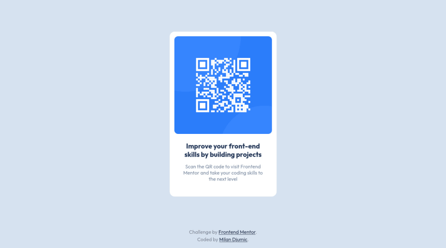
Design comparison
Community feedback
- @khushi0909Posted over 1 year ago
some recommendations
1)you should learn about semantics HTML and using it for ex footer ,main etc 2)image shoult always have alt="some description".some description about image should always be there for accessibility reasons
https://www.davidmacd.com/blog/alternate-text-for-css-background-images.html
3)Read about h1 tag its the most important and every website should have atleast one https://www.semrush.com/blog/h1-tag/
4)image doesnt seems to be center in your site if i remove the footer- made by and all ,so you need to learn to center some ways are that you can read about - min height to be used in body read about translate property or marging auto properties read about centering properties and how it is done
All the best
Marked as helpful0
Please log in to post a comment
Log in with GitHubJoin our Discord community
Join thousands of Frontend Mentor community members taking the challenges, sharing resources, helping each other, and chatting about all things front-end!
Join our Discord
