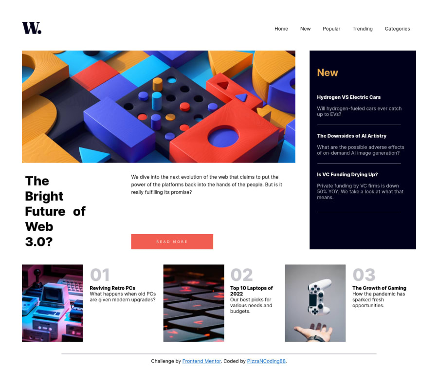
Design comparison
Solution retrospective
I have not encountered many obstacles in completing this challenge, but I would love to hear opinions on my solution.
Community feedback
- @AdrianoEscarabotePosted almost 2 years ago
Hello PizzaNCoding88, how are you? I truly loved your project's outcome, however I have some advice that I hope you'll find useful:
I noticed that you used a
buttonin which case the best option would be ana, because in my head when a person clicks on a button written Read more, he is not confirming a form, or something like, it will be redirected to another page, to read more about!to solve this problem do this:
<a href="/" class="articles-section__btn">Read more</a>If we see how the layout is behaving at higher resolutions, with the help of google dev tools, we will see that it is stretching a lot, to solve this we can use a max-width with the value we want the content to stop growing and to center use a margin: 0 auto;
body {
    max-width: 1440px;
    margin: 0 auto;
}
The remainder is excellent.
I hope it's useful. 👍
Marked as helpful0@PizzaNCoding88Posted almost 2 years ago@AdrianoEscarabote Thanks for your suggestions Adriano.
I thought the layout would need to stretch that much in desktop mode, but the tip you provided is so useful, I love it.
Re the button, that looked to me like a button on which you click and opens a new page with the article (I may be wrong). That is the reason why I have used button and not a link.
0
Please log in to post a comment
Log in with GitHubJoin our Discord community
Join thousands of Frontend Mentor community members taking the challenges, sharing resources, helping each other, and chatting about all things front-end!
Join our Discord
