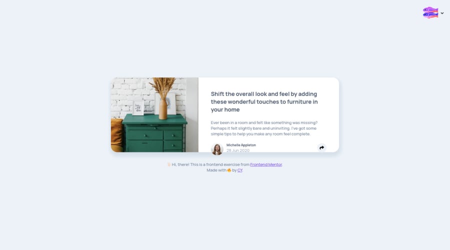
Design comparison
Solution retrospective
For me, the difficult part is the different styles for share buttons on desktop & mobile. My solution is using two snippet code to achieve it, this also makes the javascript more complicated.
Community feedback
- @grace-snowPosted over 4 years ago
Hi, This looks really good!
You could definitely do this with one share block but theres nothing wrong with how you've done it now.
The only things that need addressing are accessibility related really:
- alt text on the main image should be describing the image if the image is meaningful, or empty if it is not
- all the buttons need accessible names (aria-labels). All the social ones would probably be anchor tags (links) not buttons too.
That's all from me. I'm really looking forward to seeing what you submit next ☺
Ps. Remember to upvote comment if you find it helpful, thanks
1@cyisherePosted over 4 years ago@grace-snow Hi, Grace. I fixed the accessibility issues. But about the social buttons, I think when the user press it, it would call a function to open a new window to write sth first then share, so I keep them buttons. (Although I need to add those functions either.😄) Thank you again. 🙏🏻
0@grace-snowPosted over 4 years ago@cyishere they would still have to be interactive html elements. Icons themselves don't get clicked, the interactive tag wrapping them is what a user focuses on / clicks / taps / uses keyboard or other control to press. ☺
0
Please log in to post a comment
Log in with GitHubJoin our Discord community
Join thousands of Frontend Mentor community members taking the challenges, sharing resources, helping each other, and chatting about all things front-end!
Join our Discord
