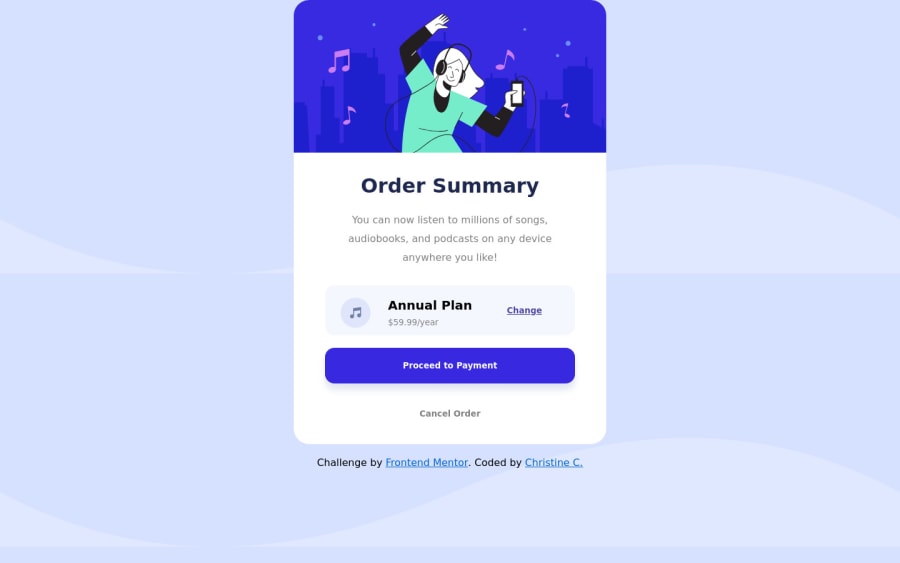
Design comparison
Solution retrospective
Hi all!
Thanks for taking the time to look at my code.
I'd love some feedback on my general syntax (i.e. if the comments are relevant or if I have any redundant properties in CSS).
Also, one thing that has been bugging me is that on the Subscribe button, the 'Change' text will not align to the very right and I would love to know how to do that.
xoxo
Christine
Community feedback
- @pikapikamartPosted about 3 years ago
Hey, awesome work on this one. Layout in general looks great.
You already got great suggestions from others which is really nice seeing other giving much feedbacks, just going to add some suggestions as well mostly in markup:
- It would be really great to have these as a base styling:
html { box-sizing: border-box; font-size: 100%; } *, *::before, *::after { box-sizing: inherit; }
With this, it will make handling element's sizes easier. You can search up more about
box-sizing
- Always have a
main
element to wrap the main content of your page. On this one, the.container
should be using themain
instead ofdiv
. - You don't need the
margin
on the.container
to place it properly, you would only needmin-height: 100vh
on thebody
tag. But it is hard to tell a proper css on this right now because you are not usingbox-sizing: border-box
. - Those decorative images on the site could have use an extra
aria-hidden="true"
attribute so that they will be totally hidden alongside with thealt=""
- You don't use
button
to wrap a section-content, so your.subscription
should either be asection
ordiv
. - Same goes for the music-icon hide it using the method I mentioned above.
change
should be either a linka
tag orbutton
. Interactive components uses interactive elements.
Aside from those , great work again on this one.
Marked as helpful0 - @CyrusKabirPosted about 3 years ago
hello my dear friend ♥ you did good and clean but here some advices :
- don't use uppercase and lowercase at same time in naming files or assets just add an simple lower case name to it like ( example : style.css or custom.css )
- if you want to reset some elements you can use css resets we have many of them on the web you can search them and choos them and pick them
- in commenting you code it's better to have your code in different section like : /* General / , / Layout / , / Utility */ , etc
- fill the alt attribute in img tag !!! it's important because of " ACCESSIBILITY " , "SEARCH OPTIMAZITION" , ...
- use more semantic tags or elements like (<main> , <footer> , <article> , etc )
- and for last block elements like <div> should not be child of an inline element
Marked as helpful0 - @Carlos-A-PPosted about 3 years ago
A few suggestions:
- The top of the .container seems to be too close to the top of the window so try adding some padding-top or margin-top
- for the change text, you can add a class to your p tag's parent div. Then change the margin from auto to maybe margin-right: #px;
- the background image of your body tag seems to have
background-repeat: none;
which is invalid. Change it tobackground-repeat: no-repeat;
Marked as helpful0
Please log in to post a comment
Log in with GitHubJoin our Discord community
Join thousands of Frontend Mentor community members taking the challenges, sharing resources, helping each other, and chatting about all things front-end!
Join our Discord