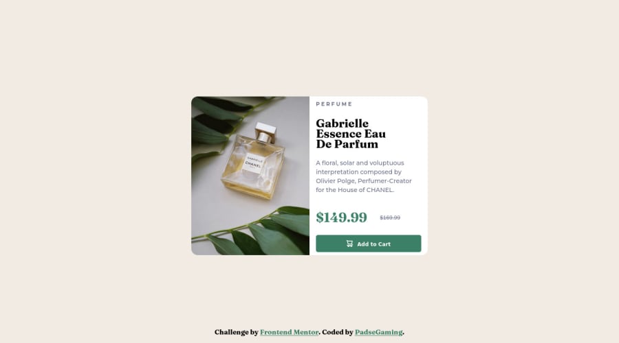
Design comparison
Solution retrospective
Difficult was again the perfect centering of the card.
Another difficult was to implement the responsitivity to all screensizes. I have to learn which code i have to use, to resize the whole container within all of the childs to get a fully responsible website in less than 2 hours. It take to long time to design such a simple Website.
But, learning by doing. I look forward to get better so that this will no longer take so long time. Thats why i do this challenges.
Community feedback
- @darrowvPosted almost 2 years ago
Hello, nice work!
For centering the card in this type of page you can just use
display: grid, place-items: centeron card's container element (and this element should have height of whole page of course, I useheight: 100vh)0
Please log in to post a comment
Log in with GitHubJoin our Discord community
Join thousands of Frontend Mentor community members taking the challenges, sharing resources, helping each other, and chatting about all things front-end!
Join our Discord
