Submitted almost 3 years ago
CSS flex, grid, functions, fluid typography, position, Vanilla JS
@micoirvin
Design comparison
SolutionDesign
Solution retrospective
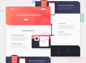
Thanks for viewing my project. The main challenge for this project is the layout of the images. My solution was to use top, right, left, and bottom properties to properly position them based on my measurements from the mockup. I also used clamp() and calc() functions to smoothly adjust the size and position of the images across all viewport widths -- an approach somewhat similar to fluid typography.
Community feedback
Please log in to post a comment
Log in with GitHubJoin our Discord community
Join thousands of Frontend Mentor community members taking the challenges, sharing resources, helping each other, and chatting about all things front-end!
Join our Discord
