Design comparison
SolutionDesign
Solution retrospective
What are you most proud of, and what would you do differently next time?
con la practica me fue un poco mas sencillo y rápido acabar este desafío
What challenges did you encounter, and how did you overcome them?poder hacer la letra mas robusta en ciertas partes del blog
What specific areas of your project would you like help with?como aprender a usar mejor el @media para poder hacer sitios responsive
Community feedback
- @snigdha-sukunPosted 5 months ago
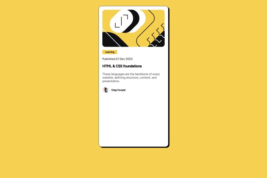
Your overall solution looks good, specially the positioning of all html elements.
Here are a few things that might be helpful to make your solution better:
- The avatar image is going outside the box. To fix it, you should try using:
.container{ display: block; }- add the hover effect for the heading
h3:hover { cursor: pointer; color: hsl(47, 88%, 63%); }- You should use atleast 1
h1in the page for accessibility
Marked as helpful1
Please log in to post a comment
Log in with GitHubJoin our Discord community
Join thousands of Frontend Mentor community members taking the challenges, sharing resources, helping each other, and chatting about all things front-end!
Join our Discord
