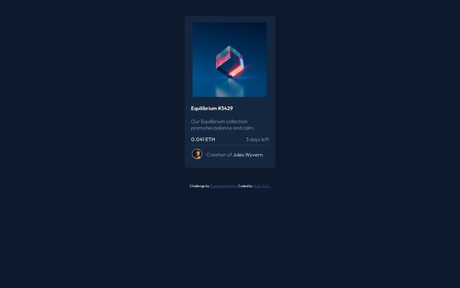
Design comparison
Solution retrospective
It was fun making this project. I used flex-box, also used table for arrangin the elements in horizontal manner. Also learned that if used padding the border will be affected.
Community feedback
- @solracssPosted over 1 year ago
Do not use table to arrange items. Utilize flexbox or grid. Your solution is missing hover effects :(
0 - @javascriptor1Posted over 1 year ago
Hi Nyaymurti Gaikwad ,
Nice job. Few things could be improved for better results : 1- Center the main design in the middle of screen. use flexbox or grid or even absolute positioning for this. 2- The image is not aligned with h1 and p tags. All elements should start at same y axis. 3- The paragraph is not the same of design - see where text break into new line. 4- Your design overlooked the active state of the challenge. Please give it a look.
Keep coding 🚀
0
Please log in to post a comment
Log in with GitHubJoin our Discord community
Join thousands of Frontend Mentor community members taking the challenges, sharing resources, helping each other, and chatting about all things front-end!
Join our Discord