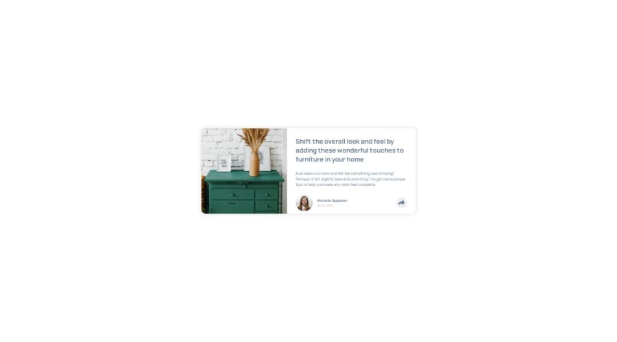
Design comparison
Solution retrospective
by making this project i came to know that how good and efficient CSS is important for a developer which helps to get rid with repetitive code. So next time i will try to enhance my code optimization skills and work more on them. Thank You ......
What challenges did you encounter, and how did you overcome them?Honestly its not that much challenging so i actually didn't encounter as such challenge but yes whenever i got stuck on some problem i refer to google and MDN documents which helps me a lot. Thank You.....
What specific areas of your project would you like help with?I like CSS part very much and also enjoys it while coding. But not a lie i also like Js part but only when the problem is solving step by step whenever it get stuck for more than 30-40 minutes i lose my patience. Its all about this but working on that stuck part and get success in that is another level of happiness for me. Thank You....
Community feedback
- P@danielmrz-devPosted 12 months ago
Hello @Deepu23456!
Your solution looks excelent!
I have just one suggestion:
📌 To improve semantic clarity, opt for
<h1>over<h3>for your main title.It's more than just text size — it's about structuring your content effectively:
<h1>to<h6>are used to define HTML headings, with<h1>being the most significant.- Stick to one
<h1>per page for the main title, and maintain the titles hierarchy with<h1>,<h2><h3>, and so on.
While these adjustments might not alter the visual appearance much, they significantly enhance semantic clarity, SEO optimization, and accessibility.
Hope this suggestion proves helpful! Keep up the great work!
Marked as helpful0 - @Code-BeakerPosted 12 months ago
Hi there, you've done a great job regarding this solution.
Here are some issues that I came across in your solution:
- It seems like there is a white box below the pop-up and also the popup is not in the right position.
- On mobile, the pop-up does not have proper width. It overflows the container.
Here's how you can improve your code in this one:
- instead of creating a
share-containerelement, place theshareinside theprofile-sectionitself. Then give theprofile-sectionthe following properties:
.profile-section { position: relative; }- then give the
shareelement:
.share {
position: absolute;
right: 0;
bottom: 25px; /* change this value if you want */
}
There is no need of the
share-container.- I see that you've tried to create the little triangle that joins it with the share icon. But it's actually blocking the content beneath it.
These are small issues that can be solved to make the website better. I hope you look into the problem and understand how to fix it.
Hope this helps you improve your solution!
0
Please log in to post a comment
Log in with GitHubJoin our Discord community
Join thousands of Frontend Mentor community members taking the challenges, sharing resources, helping each other, and chatting about all things front-end!
Join our Discord
