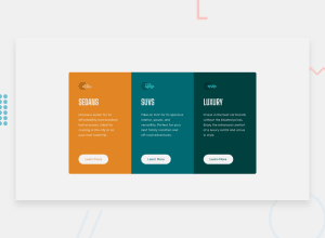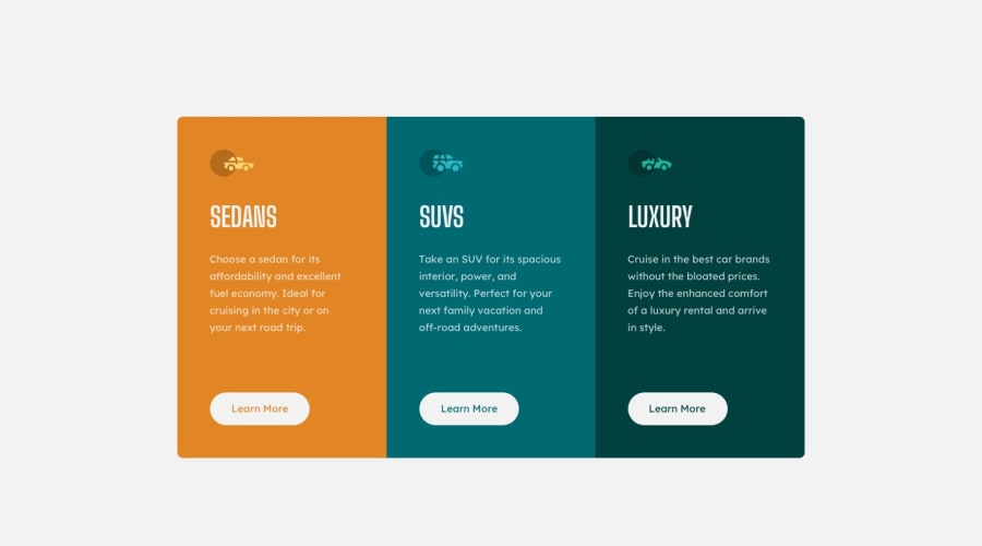
Design comparison
Solution retrospective
nice challenge newbie
Community feedback
- @Jorgus1710Posted over 2 years ago
Hey Jose, nice work on the challenge! :)
There are some minor adjustments that you could make which will make the design more true to the original source material;
- Your headings for each card should use a different font than the main text underneath it. Have a look at the style guide and you will find it there.
- The main text in the cards should be a bit smaller.
- The design of the buttons you have displayed at the moment would be the desired result when you apply a ':hover' state to them. In the original design it is just a simple solid white background when not hovered on. As well you can try to reduce the padding on the top and bottom of the buttons to make them a bit thinner.
At the moment it looks like the challenge is not mobile friendly or responsive, I would highly recommend to get in the habit of designing for mobile first. It will be super beneficial and it will make things much easier in the future. I know this tip alone has helped me tremendously.
I hope this helps, you did an excellent job! Keep it up! 👏 👏
0@PenaJ15Posted over 2 years ago@Jorgus1710 hello, I appreciate your comment and the suggestions you give me, I will take them into account to continue progressing and improving the designs. happy day!
1
Please log in to post a comment
Log in with GitHubJoin our Discord community
Join thousands of Frontend Mentor community members taking the challenges, sharing resources, helping each other, and chatting about all things front-end!
Join our Discord
