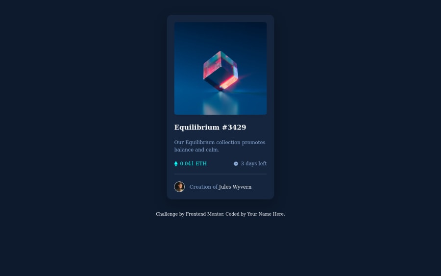
Design comparison
SolutionDesign
Solution retrospective
I created a Figma file because I'm not a full member yet. So I know it's not pixel perfect. The only things that bugs me is the small padding you can notice at the bottom of the image when you roll over it.
Community feedback
- @Haico-PaulussenPosted almost 3 years ago
Hi @Eric-Ferole ,
Great work. You should really take a look at the accessibility and HTML report from FEM. It will make your code a bit better!
Some points:
- Your hover overlay on the image is a little bit off. Take a look at that.
- I like how you use Flexbox and CSS Grid together.
Great effort and keep on coding!
Marked as helpful0 - @byronbyronPosted almost 3 years ago
If you set the image to
display: block;
that should get rid of the small gap!Marked as helpful0@Eric-FerolePosted almost 3 years ago@byronbyron Thanks a lot Byron. It worked :) Very happy. Have a good day.
0
Please log in to post a comment
Log in with GitHubJoin our Discord community
Join thousands of Frontend Mentor community members taking the challenges, sharing resources, helping each other, and chatting about all things front-end!
Join our Discord