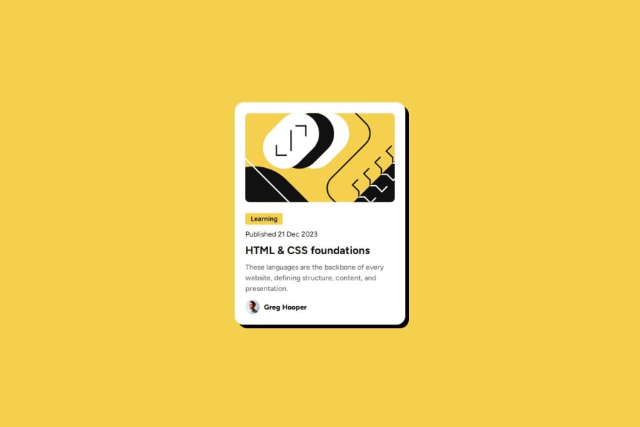
Design comparison
Solution retrospective
I'm proud of completing the project utilizing minimal code. I would perhaps use a few more divisions to clean up the code an seperate each section further.
What challenges did you encounter, and how did you overcome them?The biggest challenges I encountered were deciding the elements to use for the learning and title. I decided that the figma demonstrated a look that made me use a button for the learning element and to include an anchor element for the title due to it having an active state.
What specific areas of your project would you like help with?I would like to ensure that the code is readable and accessible, an provides good performance.
Community feedback
- P@wiceldric75Posted 4 months ago
Your solutions looks pretty good but it looks like you did not implement the mobile design and it is not responsive.
0@PatLattingPosted 4 months ago@wiceldric75
Thanks for the comment, I was able to add some mobile responsive design to the project. Still need to learn how to make the card responsive when you rotate, but made it responsive in the portrait view.
0
Please log in to post a comment
Log in with GitHubJoin our Discord community
Join thousands of Frontend Mentor community members taking the challenges, sharing resources, helping each other, and chatting about all things front-end!
Join our Discord
