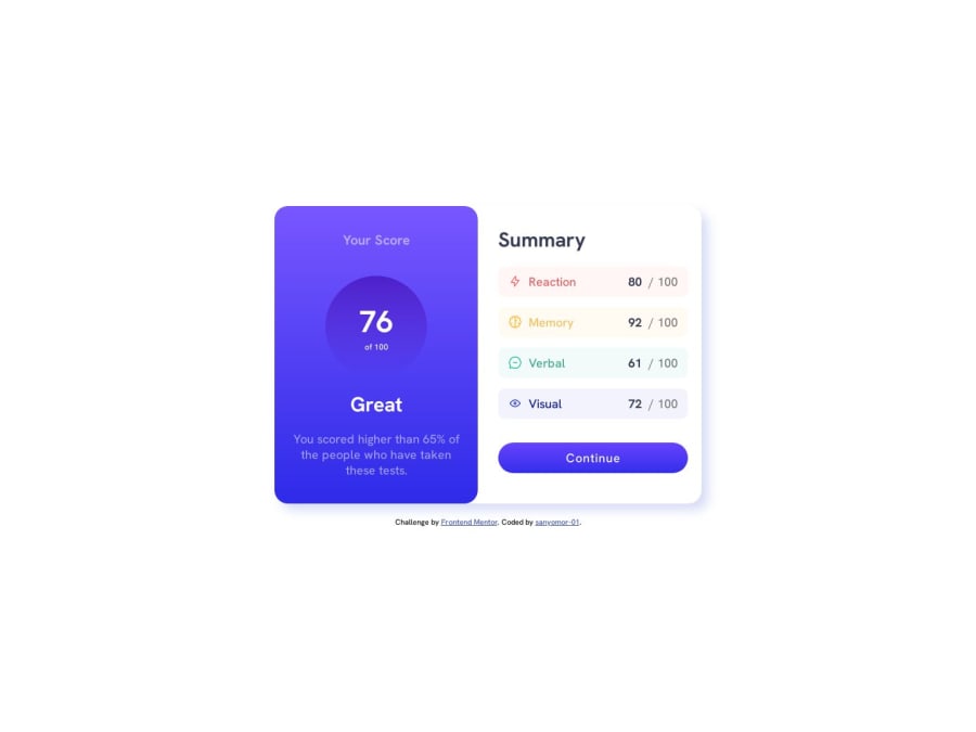


Design comparison

Solution retrospective
I encountered challenges while trying to center a div using flex. I found it difficult to achieve the desired alignment and positioning. I'm unsure of the "Summary" in the scores. What are some recommended strategies for effectively centering a div using Flexbox and ensuring responsive design?
Community feedback
- @bccpadgePosted over 1 year ago
Hello @sanyomor-01. Welcome to Frontend Mentor Community!! 🎉
When building these projects the best approach is start Mobile-first workflow and then do desktop. To answer your question, by default elements are column and you can change the layout using
<flex-direction>CSS property.Here is a CSS Grid example below.
HTML📃:
<main>
    <article>
       <div class="flex-1">Flexbox group 1</div>
       <div class="flex-2">Flexbox group 2</div>
      </article>
    </main>
CSS🎨:
- You can use flexbox and or CSS Grid in most every project. CSS Grid saves you few lines of CSS as well.
/* Using CSS Grid places content in the center of the page*/
main {
  display: grid;
  place-content: center;
  min-height: 100vh;
}
/*Grid template columns gives you two columns side by side*/
@media (min-width: 50em) {
  article {
    display: grid;
    grid-template-columns: repeat(2, 1fr);
    gap: 1rem;
  }
}
Here is my solution to this challenge Results summary component
Hope that I answer your question and don't hesitate to reach out to me if you have any questions
Marked as helpful1

Please log in to post a comment
Log in with GitHub
Join our Discord community
Join thousands of Frontend Mentor community members taking the challenges, sharing resources, helping each other, and chatting about all things front-end!
Join our Discord