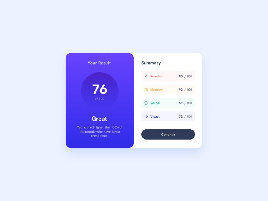
Design comparison
Solution retrospective
I am getting better in using css flex
What challenges did you encounter, and how did you overcome them?color mixing
What specific areas of your project would you like help with?css flexbox
Community feedback
- @AutumnsCodePosted 9 months ago
I really enjoy your solution. There a few things thats needs improvement.
I didn't see any h1-element in the html-file. There should be one. The next heading element should be a h2-element. With the help of classes you can style both elements at the same time. like giving the same font-size and font-weight Also I did realise you didn't center enough. There is an easy solution for it, just add additonal styling for your body like this:
body {
 min-height: 100svh; /*its important otherwise it wont work*
 display: flex;
 justity-content: center;
align-items: center;
}
Keep up your good work!
0 - @ZenosakiPosted 9 months ago
You've done a great job on your project! Here are a few tips to help you improve further:
Firstly, make sure to utilize the README file provided by Frontend Mentor, as it includes the necessary fonts and colors to prevent any issues with color mixing. For example, you can use the linear gradient syntax in CSS like this: background: linear-gradient(direction, color1, color2, ...);.
Additionally, while you did an excellent job with the CSS Grid, don't forget to include gaps for better spacing using grid-gap: 20px;.
When it comes to using headers (h1, h2, etc.), remember it's not just about font size. Use h1 for the most important heading (only one per page) and proceed with h2, h3, etc., in descending order of importance.
Overall, you did well and can further improve by practicing. Once you're confident, try the challenge again and post a new solution. Keep up the good work!
0
Please log in to post a comment
Log in with GitHubJoin our Discord community
Join thousands of Frontend Mentor community members taking the challenges, sharing resources, helping each other, and chatting about all things front-end!
Join our Discord
