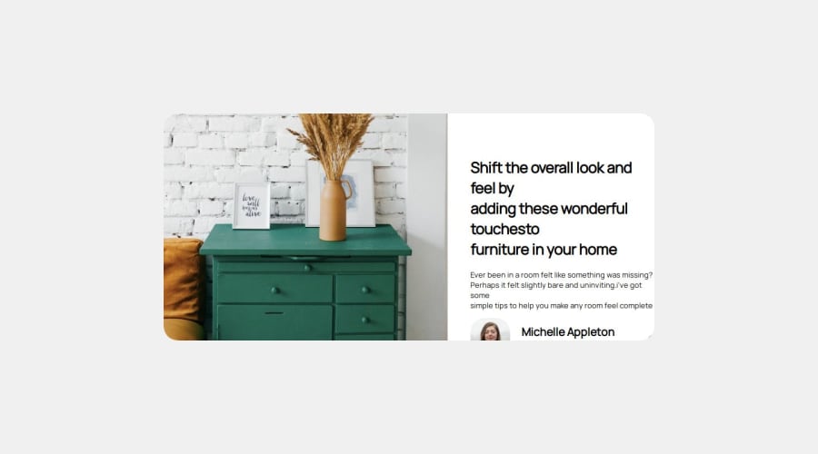
Design comparison
SolutionDesign
Solution retrospective
What are you most proud of, and what would you do differently next time?
im proud about not give upping and second time i will better study basics
What challenges did you encounter, and how did you overcome them?mobile version text problems in where was name im just change width to min-width
What specific areas of your project would you like help with?object overflow
Community feedback
Please log in to post a comment
Log in with GitHubJoin our Discord community
Join thousands of Frontend Mentor community members taking the challenges, sharing resources, helping each other, and chatting about all things front-end!
Join our Discord
