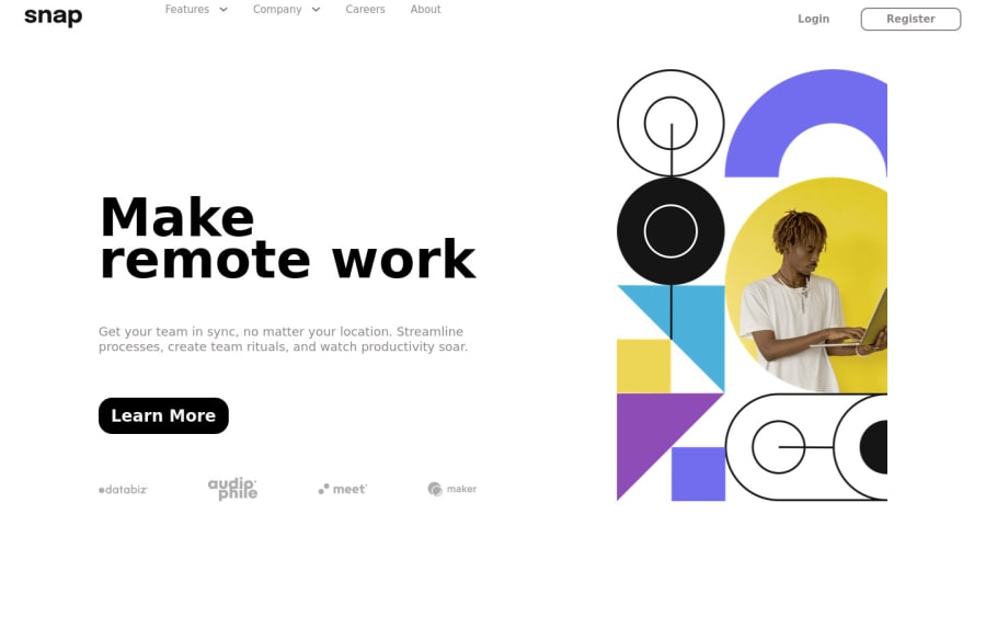
Design comparison
Solution retrospective
Getting the image size right and scale correctly for different screen sizes was kind of annoying. Wasn't expecting that.
Community feedback
- @Catalyst497Posted over 2 years ago
Wow, I love this solution.
I just think if you were using flexbox for your navbar. You could add an align-items: center to it to make the items vertically centered.
You can find my solution here: https://www.frontendmentor.io/solutions/flexbox-plenty-of-grid-layout-_rQIc3AANQ
Marked as helpful1 - @tesla-ambassadorPosted over 2 years ago
Hey Shekinah007. Congrats on completing this wonderful solution. I really like how responsive it is and the exit animations of the desktop nav at a significantly smaller screen width! It's really great! A few things you might want to consider:
- I'd suggest that you add some padding a top your nav bar because it's a little too close to the edge. You might also want to trigger the drop down menu with a click but in the case of having to trigger it with hover, you should keep the drop down menu such that it doesn't disappear when a user hovers away from the link that triggered it. It'd be great if it disappears when you click one of the sub-links. Because you are using REACT I suggest that you use the onMouseEnter event to conditionally render the drop down menu and then a click event on one of the liks to change the conditions to false and stop rendering the element.
- Inorder to fix some of your accessibility issues, you might want to add landmarks (
<main>
,<footer
> etc.) to your page so that the browser can easily navigate your site. If you want to know more on landmarks, follow this link. - You should consider using
divs
as parent elements oful
or anotherdiv
as a parent element of anotherdiv
because it's not valid HTML for span to be a parent to any of those. This will fix your HTML validation issues. Happy coding and keep up the good work, you're doing really great!
Marked as helpful1@Shekinah007Posted over 2 years ago@tesla-ambassador Thanks. I've always used divs for just about everything. Never realized how important those landmark elements are. Really need to learn more about using semantic html elements.
1
Please log in to post a comment
Log in with GitHubJoin our Discord community
Join thousands of Frontend Mentor community members taking the challenges, sharing resources, helping each other, and chatting about all things front-end!
Join our Discord