Solution retrospective
What are you most proud of, and what would you do differently next time?
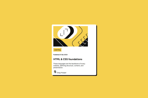
I am proud of being able to complete this solution and they appear to be similar.
What challenges did you encounter, and how did you overcome them?I had difficulty trying to centre the image and round its corners, I tried using class selector as per the HTML (.svg) but this wasn't working. I had also tried setting the width but this threw it odd completely.
What specific areas of your project would you like help with?How should I have rounded the corners of the image? Also how to centre the name by the image of Gregg so it's inline.
Code
Loading...
Please log in to post a comment
Log in with GitHubCommunity feedback
No feedback yet. Be the first to give feedback on Ashum91's solution.
Join our Discord community
Join thousands of Frontend Mentor community members taking the challenges, sharing resources, helping each other, and chatting about all things front-end!
Join our Discord