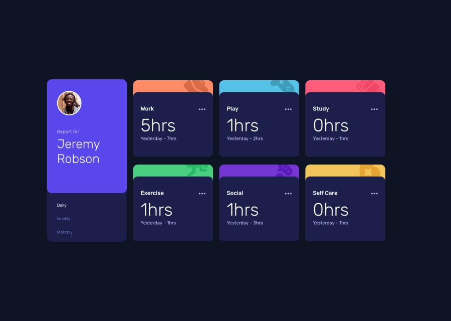
Design comparison
SolutionDesign
Community feedback
- @kerminekPosted almost 3 years ago
- Dots are not changing color on hover(If i remember correctly, you should use "fill" not on a svg but instead on a "path" inside svg ).
- Whole app is not centered(Just use flexbox on the main container, then justify-content:center, align-items:center ).
- Colored background is overlaying the dark one(zoom in, it's visible especially on the bottom)(Try to use overflow:hidden).
- Mobile version is not accurate at all.
- You can improve spacings and font size on left dark box.
0
Please log in to post a comment
Log in with GitHubJoin our Discord community
Join thousands of Frontend Mentor community members taking the challenges, sharing resources, helping each other, and chatting about all things front-end!
Join our Discord
