Design comparison
Solution retrospective
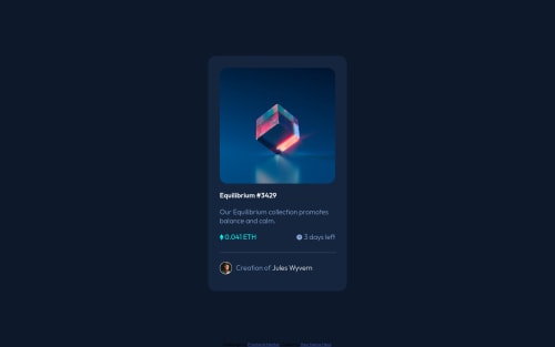
can u give me best pactice about change image when cursor hover that image, and pls tell me if i do something wrong
Community feedback
- @PhoenixDev22Posted about 2 years ago
Hello Buci,
Congratulation on completing this challenge. Excellent work! I have few suggestions regarding your solution, if you don't mind:
HTML
- Page should contain a level-one heading. In this challenge , as it’s not a whole page, you can have
<h1>
to wrap theEquilibrium #3429
instead<p>
.
- The most important part in this challenge interactive elements. Since there's a :hover state on the image and means it's interactive, So there should be an interactive element around it. When you create a component that could be interacted with a user , always remember to include interactive elements like(button, textarea,input, ..)
for this imagine what would happen when you click on the image, there are two possible ways:
1: If clicking the image would show a popup where the user can see the full NFT, here you use<button>
. 2:If clicking the image would navigate the user to another page to see the NFT, here you can use<a>
.
For the same reason , you can use
<a>
to wrapEquilibrium #3429
.- The link wrapping the equilibrium image should either have
Sr-only
text, anaria-label
oralt
text that says where that link takes you.
- For any decorative images, each img tag should have empty
alt=""
and addaria-hidden="true"
attributes to make all web assistive technologies such as screen reader ignore those images in(icon-view, icon-ethereum, icon-clock ).
- Profile images like that avatar are valuable content. The alternate text of the avatar’s image should not be empty. You can use the creator's name
Jules Wyvern
. Read more how to write an alt text
- If you wish to draw a horizontal line, you should do so using appropriate CSS. You may remove the
<hr>
, you can useborder-top:
to the avatar's part.
- There are so many ways to do the hover effect on the image, The one I would use is pseudo elements
::before, ::after
. You can use pseudo-elements to change the teal background color to hsla. Then the opacity can be changed from 0 to 1 on the pseudo element on the hover. Also using pseudo elements makes your HTML more cleaner as there's no need for extra clutter in the HTML.
- Adding
rel="noopener"
orrel="noreferrer"
totarget="_blank"
links. When you link to a page on another site usingtarget=”_blank”
attribute , you can expose your site to performance and security issues.
Aside these, great work on this one. Hopefully this feedback helps.
Marked as helpful1@alphardhafizPosted about 2 years ago@PhoenixDev22 wow, there's a lot thing that i know from your feedback, thanks a lot 😁
1 - Page should contain a level-one heading. In this challenge , as it’s not a whole page, you can have
- @ASH2001princePosted about 2 years ago
Hello Buci congrats for your new project I have a few tips for you -I think the .card height should leave it by default because its taking much more height than it should be also the card padding should be reduce about 10px in order to make the main image in full width. -If you add the icon image in the ::after selector by using the content URL it would be easier to align it.
.card .nft-image::after{ content: url(images/icon-view.svg); display: flex; align-items: center; justify-content: center; height: 98%; opacity: 0; width: 100%; position: absolute; background-color: hsl(178, 100%, 50%, 40%);; top: 0; cursor: pointer; border-radius: 10px; transition: opacity 0.4s ease-in-out; } .nft-image:hover::after{ opacity: 1; }
this is how I worked on it. hope you find my comment helpful
Marked as helpful1
Please log in to post a comment
Log in with GitHubJoin our Discord community
Join thousands of Frontend Mentor community members taking the challenges, sharing resources, helping each other, and chatting about all things front-end!
Join our Discord