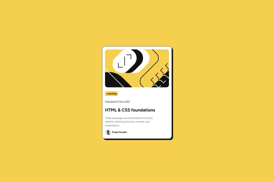


Design comparison

Community feedback
- P@StroudyPosted 7 months ago
Exceptional work! You’re showing great skill here. I’ve got a couple of minor suggestions that could make this stand out even more…
-
Avoid using
idselectors for styling in CSS because they are too specific and hard to override, making your styles less flexible and maintainable. Instead, use class selectors (.), which are reusable and more manageable, allowing for better control over your styles and easier updates. -
Dont need these divs wrapping your h5,
<div class="box" > <h5>Learning</h5> </div>- Your heading elements
<h5><h1>, Heading elements should be in sequentially-descending order (e.g.,<h1>,<h2>,<h3>) to create a clear content structure, improving accessibility and SEO. Skipping levels or using them out of order can confuse screen readers, affect search engine rankings, and make your content harder to understand.
<h5>Learning</h5> <h1>HTML & CSS foundations</h1>-
Using a full modern CSS reset is beneficial because it removes default browser styling, creating a consistent starting point for your design across all browsers. It helps avoid unexpected layout issues and makes your styles more predictable, ensuring a uniform appearance on different devices and platforms, check out this site for a Full modern reset
-
I think you can benefit from using a naming convention like BEM (Block, Element, Modifier) is beneficial because it makes your CSS more organized, readable, and easier to maintain. BEM helps you clearly understand the purpose of each class, avoid naming conflicts, and create reusable components, leading to a more scalable codebase. For more details BEM,
-
While
pxis useful for precise, fixed sizing, such asborder-width,border-radius,inline-padding, and<img>sizes, it has limitations. Pixels don't scale well with user settings or adapt to different devices, which can negatively impact accessibility and responsiveness. For example, usingpxfor font sizes can make text harder to read on some screens, Check this article why font-size must NEVER be in pixels. In contrast, relative units likeremand adjust based on the user’s preferences and device settings, making your design more flexible and accessible. Usepxwhere exact sizing is needed, but prefer relative units for scalable layouts. If you want a deeper explanation watch this video by Kevin Powell CSS em and rem explained. Another great resource I found useful is this px to rem converter based on the default font-size of 16 pixel.
I hope you’re finding this guidance useful! Keep refining your skills and tackling new challenges with confidence. You’re making great progress—stay motivated and keep coding with enthusiasm! 💻
Marked as helpful1@Olaniyi-FatolaPosted 7 months agoThanks for the suggestions @Stroudy . Will go through the referenced articles and videos and also make sure to refine the css. I really appreciate you
1@Olaniyi-FatolaPosted 7 months agoHi @Stroudy , I went through all resources you provided and I really enjoy that of Kevin Powell and I've made adjustments to the css codes. Thanks for the useful information share, I really appreciate and I wish to keep seeing you on this space
1 -
- @mth-aniPosted 7 months ago
good job on completing the challenge. I'll suggest on increasing the font size of your description
1@Olaniyi-FatolaPosted 7 months ago@mth-ani Oh, Thanks for the suggestion, will do that
0


Please log in to post a comment
Log in with GitHub
Join our Discord community
Join thousands of Frontend Mentor community members taking the challenges, sharing resources, helping each other, and chatting about all things front-end!
Join our Discord