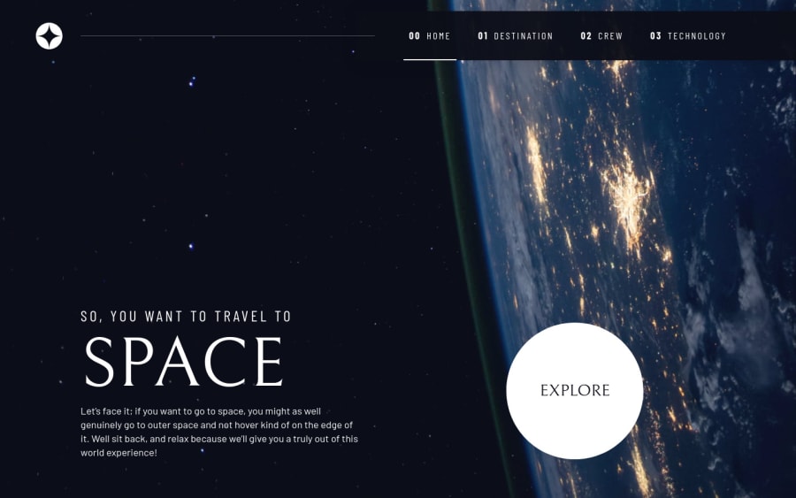
Submitted over 3 years ago
CSS custom properties, Flexbox, CSS Grid, Mobile-first, native JS
@DannyLenk
Design comparison
SolutionDesign
Solution retrospective
Yes, please. There is a thing that bothers me the most. Why could a hidden attribute not work in some places? For example, on the "destination" and "crew" pages' <article>s it works, whereas on the "technology" one it doesn't. The same problem was with the <div>s containing imgs on the technology page. So, I had to add some changes to the js files.
Community feedback
Please log in to post a comment
Log in with GitHubJoin our Discord community
Join thousands of Frontend Mentor community members taking the challenges, sharing resources, helping each other, and chatting about all things front-end!
Join our Discord
