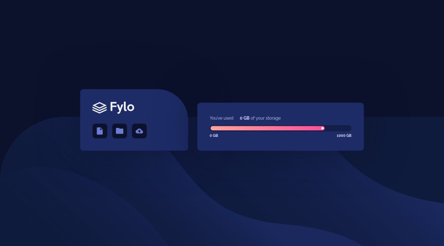
Design comparison
Solution retrospective
Hi all,
this was fun little project in which I learned something new about CSS custom properties. Never knew it is possible to create animated CSS counter with them. My focus in this exercise was to create some animations and make design more dynamic and i have completely ignored semantics and making sure that all components are accessible. Would love to hear some feedback about markup part because i'm not 100% sure which is the proper way to tag some of the elements in this design.
Cheers, Miran
Community feedback
- @AdrianoEscarabotePosted over 2 years ago
Hi Miran Legin, how are you?
I really liked the result of your project, but I have some tips that I think you will like:
I noticed that the background image was breaking, to fix this we can do this:
@media (min-width: 768px) body { background-position: bottom; background-size: 100% 50vmin; }This way the image will stretch at all resolutions. The rest is great!! Hope it helps... 👍
Marked as helpful0P@miranleginPosted over 2 years ago@AdrianoEscarabote -
Hi Adriano, thanks for the input, never worked with vmin before so this is something new for me.
Cheers, Miran
1
Please log in to post a comment
Log in with GitHubJoin our Discord community
Join thousands of Frontend Mentor community members taking the challenges, sharing resources, helping each other, and chatting about all things front-end!
Join our Discord
