Design comparison
Solution retrospective
This is my second challenge in two days. I really like working on such challenges because it gives me a chance to apply what I have learned on real world challenges. I am still using basic concepts. Any feedback which would help me improve my skills would be appreciated.
Community feedback
- @rohits673Posted over 3 years ago
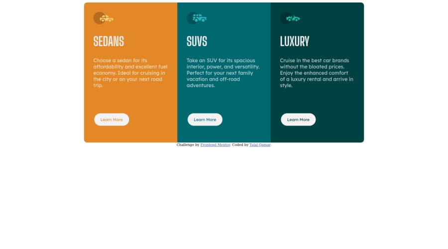
Hi Talal, you site is looking good and very accurate also. You can do some improvement as you cards are not centralized vertically you can use flexbox or grid like this
body{
min-height:100vh;
display:grid;
place-items:center;
}
It should centralize any container inside the body, let me know if it works. also around 500px width you card contents gets overflowed you can try to fix that or you can change your media breakpoint to around 768px.
Hope It helps you. Thanks!
0 - @DmytroTarasiukPosted over 3 years ago
Hello Talal! Your card looks pretty good but you also should make it responsive. Have a fun coding ;)
0
Please log in to post a comment
Log in with GitHubJoin our Discord community
Join thousands of Frontend Mentor community members taking the challenges, sharing resources, helping each other, and chatting about all things front-end!
Join our Discord
