

Design comparison

Community feedback
- P@Islandstone89Posted about 1 year ago
HTML:
-
Move the styles for
.attributionto the CSS file. -
Every webpage needs a
<main>that wraps all of the content, except for<header>andfooter>. This is vital for accessibility, as it helps screen readers identify the "main" section of a page. Change.containerto a<main>. -
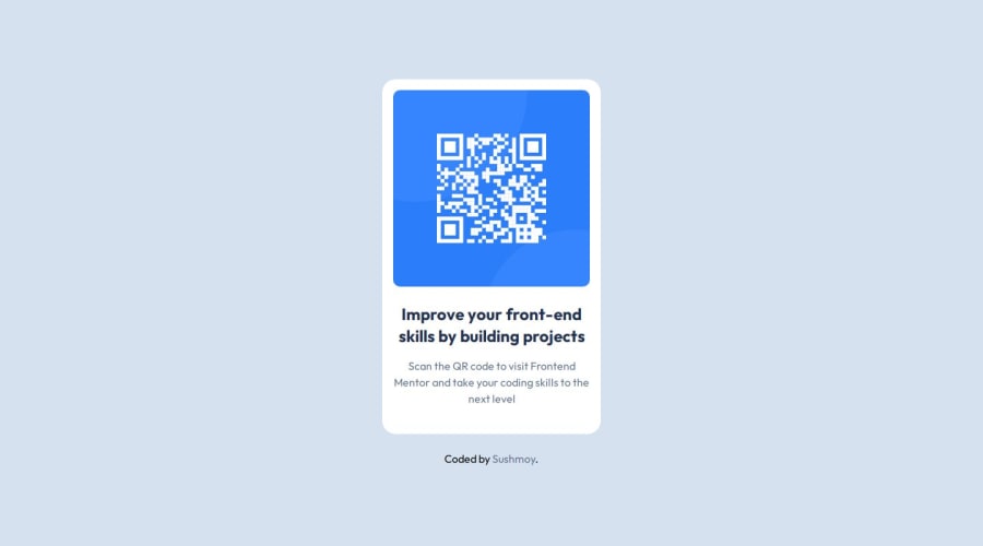
The image has meaning, so it must have proper alt text. Write something short and descriptive, without including words like "image" or "photo". Screen readers start announcing images with "image", so an alt text of "image of qr code" would be read like this: "image, image of qr code". The alt text must also say where it leads(frontendmentor.io).
-
"Improve your" is a heading - change it to a
<h1>. -
.attributionshould be a<footer>, and its text must be wrapped in a<p> -
Move the footer outside of the main, so they become siblings..
CSS:
-
It's good practice to include a CSS Reset at the top.
-
Add around
1remofpaddingon thebody, so the card doesn't touch the edges on small screens. -
On the
body, changeheighttomin-height- this way, the content will not get cut off if it grows beneath the viewport. -
On
body, addflex-direction: columnand agapof around2rem, to create some space between the main and the footer. -
On
body, changefont-sizetorem, this is super important for accessibility, as pixels prevent the font size from scaling when a user changes the default font size in their browser. -
Remove all widths and heights in
px. -
Add a
max-widthof around20remon the card, to prevent it from getting too wide on larger screens. -
Paragraphs have a default value of
font-weight: 400, so there is no need to declare it. -
On the image, add
display: blockandmax-width: 100%- the max-width prevents it from overflowing its container.
Marked as helpful1@isushmoyPosted about 1 year ago@Islandstone89 thank you immensely for dedicating your time to provide me with valuable suggestions to enhance my code. Your insights have been incredibly helpful, and I'm geniunly grateful for the knowledge I've gained from your response. Your feedback has been a tremendous learning opportunity for me, and I trully appreciate it!
1 -
- @Ezekiel225Posted about 1 year ago
Hello there 👋 @imsushmoy.
Good job on completing the challenge !
Your project looks really good!
I have a suggestion about your code that might interest you.
There is an very useful browser extension called Perfect Pixel that allow you compare with the design image and thus see the exact dimensions. I recommend it to you.
I hope this suggestion is useful for future projects.
Other than that, great job!
Happy coding.
Marked as helpful1@isushmoyPosted about 1 year ago@Ezekiel225 Thank you for your suggestion, it has been helpful!
0


Please log in to post a comment
Log in with GitHubJoin our Discord community
Join thousands of Frontend Mentor community members taking the challenges, sharing resources, helping each other, and chatting about all things front-end!
Join our Discord