CSS, CSS Animation, Flexbox, Responsive Layout
Design comparison
Solution retrospective
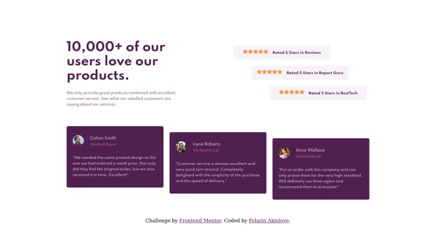
Please check the implementation and my code! I went for desktop-first design. I will go for mobile-first in my next challenge!
Community feedback
- @ApplePieGiraffePosted almost 4 years ago
Hi there, Folarin Akinloye! π
Nice to see you complete another challenge! π Good work on this one! π Your solution looks good and responds up/down pretty well!
I'd like to suggest,
- Setting
text-align
tocenter
for the heading and the description text in the mobile layout of the site (as in the original design). - Like ctnance mentioned, adding the background images from the original design using CSS background images.
- The way you named your CSS classes looks pretty similar to BEM (just add an extra underscore between terms and you'll be following BEM, too). π
It's good to see you remembered to leave out the
alt
text for the stars images (so that screen readers don't repeat themselves a whole lot). πKeep coding (and happy coding, too)! π
2@folathecoderPosted almost 4 years ago@ApplePieGiraffe Thank you for the feedback. You are sooooo awesome πππ!
- I will work on my "attention to detail"! I use a small screen to code, so switching between multiple tabs got me lazyπ€¦ββοΈ, but that's not a good excuse!
_ I was going for BEM, lol, but I totally missed an extra underscore. I will fix that in my subsequent challenges. π
Thank You!
1@ApplePieGiraffePosted almost 4 years ago@folathecoder
Haha, no problem! I often code on a smaller screen, too, and I also feel a little lazy when it comes to responsive design, sometimes. π The attention to detail is worth it, though, since it's like the icing on the cake to a good project! π
Have fun coding! π
1 - Setting
- @grace-snowPosted almost 4 years ago
Hey, looks like you've already had lots of great feedback here so I won't repeat βΊ
One small but important design point looking at your desktop preview. Do you see how in the original, the top and bottom sections align with each other on the left and right? In yours, they don't align on the right. These kind of details drive designers nuts and will be flagged as bugs by a test team, so it's good to get into the habit of noticing and fixing them now.
I hope this is helpful advice
1@folathecoderPosted almost 4 years ago@grace-snow Thank you for your feedback. I will start paying more attention to details. I appreciate your input! π
0 - @ctnancePosted almost 4 years ago
Hi Folarin, great job on this one!
I noticed you used several media queries for the same min-width; I'm not sure if this was intentional, but you could use only one for the same effect to trim down your code.
Also, don't forget you can add the background images as well with the background-image attribute.
Again, really good work--keep it up!
1@folathecoderPosted almost 4 years ago@ctnance Thank you very much for the awesome feedback. I am using a very terrible laptop to code, I did not notice the background images.
I will pay more attention to details on subsequent challenges!
Quick Question! I pretty much don't understand what you mean by
"I noticed you used several media queries for the same min-width; I'm not sure if this was intentional, but you could use only one for the same effect to trim down your code."
Is it the part where I kept adding "@include media-query (mobile)"?
Please can you show me an example and the right way to go about it because this is how I was taught!
0@ctnancePosted almost 4 years ago@folathecoder That is understandable; those background images are very subtle!
Regarding the media query, I noticed the line
@media screen and (max-width: 992)
appearing multiple times in your CSS code. I was wondering if it was intentional, or if SCSS is doing this (I have not picked up SCSS yet, so I could be missing something).Your code is very well written though, so it's only a minor thing!
1@folathecoderPosted almost 4 years ago@ctnance Oh! That is SCSS's doing. It compiled my SCSS code to CSS, so I pretty much don't have any control over the outcome.
Thank you for your observation! π
1
Please log in to post a comment
Log in with GitHubJoin our Discord community
Join thousands of Frontend Mentor community members taking the challenges, sharing resources, helping each other, and chatting about all things front-end!
Join our Discord