Design comparison
SolutionDesign
Community feedback
- @FlarienPosted 6 months ago
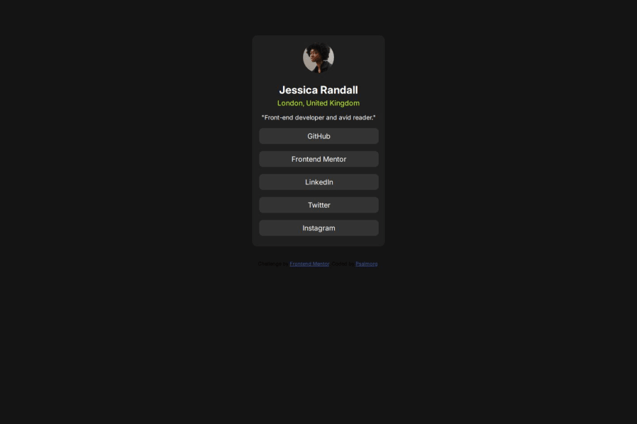
Hi! You did a great job! I recommend you wrap the whole layout in a div, like a card. Also, you could skip the use of "buttons" and style the <a> directly, since it is semantically more correct. Greetings, keep up the good work!
Marked as helpful0
Please log in to post a comment
Log in with GitHubJoin our Discord community
Join thousands of Frontend Mentor community members taking the challenges, sharing resources, helping each other, and chatting about all things front-end!
Join our Discord
