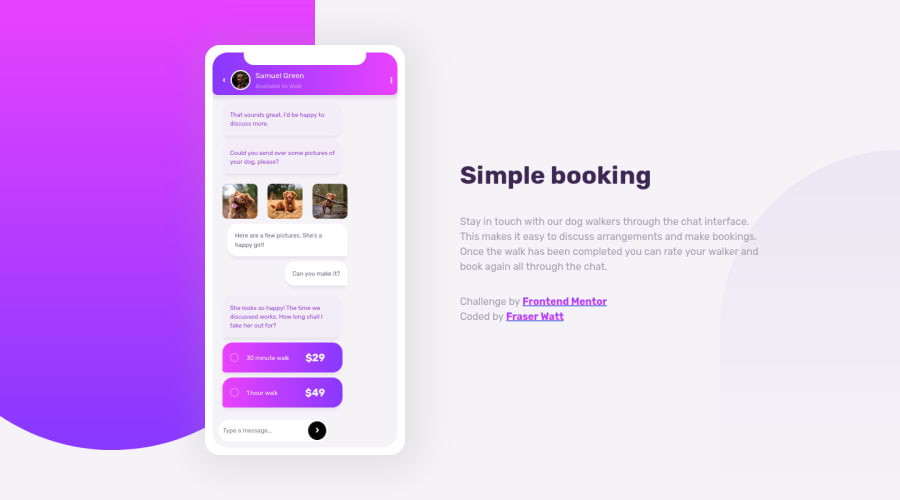
Design comparison
Solution retrospective
I've extended this one with a working chat function, which I was pretty pleased with. Any suggestions on how I could have made this simpler v much appreciated though! 😃
Nothing else with this one that's still bugging me (although maybe there's an issue I just haven't spotted! 😬), but any general adjustments, simplifications or suggestions for improvements would also be really helpful.
Community feedback
- @girlygdevPosted over 3 years ago
Nice going with extending the project to actually be able to chat in the app! I also agree with Matt that there should be some focus on the input field so users will know that they can actually type in it.
Great work!
Marked as helpful0 - @mattstuddertPosted over 3 years ago
Awesome work on this project, Fraser! I love that you've extended this project and added the dynamic chat input functionality. One way you could draw attention to the input field would be a subtle animation upon load. As it is, people might miss that they can actually type in the input field.
I'd also recommend reviewing the accessibility and HTML reports. There are some issues there that it would be great to resolve. It's good to practise clearing those reports of issues wherever possible to help build muscle memory and workflows to create accessible UIs.
Keep up the great work! 👍
Marked as helpful0
Please log in to post a comment
Log in with GitHubJoin our Discord community
Join thousands of Frontend Mentor community members taking the challenges, sharing resources, helping each other, and chatting about all things front-end!
Join our Discord