Design comparison
SolutionDesign
Solution retrospective
What are you most proud of, and what would you do differently next time?
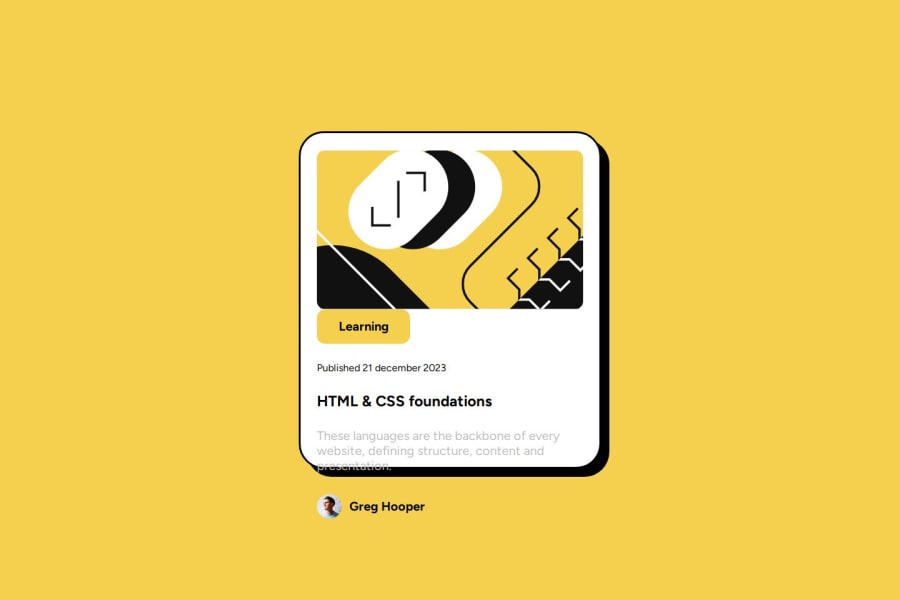
The solution preview shows my component not correctly, please check github pages, in order to see it working fine.
Community feedback
- @ricramcezarPosted 8 months ago
Remember to use the "mobile-first" treatment and only then change the desktop features. Attention to the gaps between areas of the project and the appropriate sizes. You can check that by looking at the Figma files.
0
Please log in to post a comment
Log in with GitHubJoin our Discord community
Join thousands of Frontend Mentor community members taking the challenges, sharing resources, helping each other, and chatting about all things front-end!
Join our Discord
