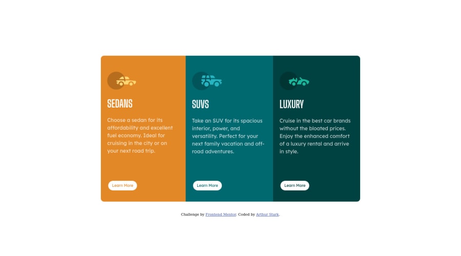
Design comparison
SolutionDesign
Solution retrospective
Aligning the <a> tags/btn on the bottom was the most difficult part.
Community feedback
- @VCaramesPosted about 2 years ago
Hey @art5551, some suggestions to improve you code:
-
The headings are being use incorrectly. For this challenge, each heading is equally as important. So best option, is to use <h2> Heading, because it will give each card the same level of importance and it's reusable.
-
Button hover color is incorrect.
-
Icons need to aligned with the text.
Happy Coding! 👻🎃
Marked as helpful0 -
Please log in to post a comment
Log in with GitHubJoin our Discord community
Join thousands of Frontend Mentor community members taking the challenges, sharing resources, helping each other, and chatting about all things front-end!
Join our Discord
