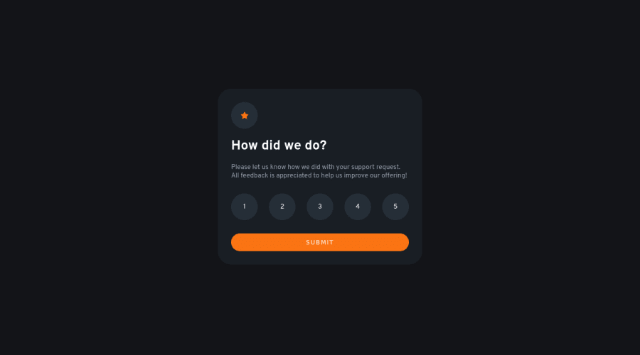
Design comparison
Solution retrospective
I really like the animations! I appreciate any feedback and help for improvement! I didn't manage to get the background of the card right, because none of the given colors matched it.
Community feedback
- @VCaramesPosted about 2 years ago
Hey there! 👋 Here are some suggestions to help improve your code:
-
The icons serve no other purpose than to be decorative; They add no value. There Alt Tag should left blank and have an aria-hidden=“true” to hides it from assistive technology.
-
The proper way to build this challenge is to create a Form and inside of it, the “rating buttons” should be built using an Input Radio and it should have a Label Element attached to it.
If you have any questions or need further clarification, let me know.
Happy Coding! 👻🎃
Marked as helpful0 -
- @AdrianoEscarabotePosted about 2 years ago
Hi philale, how are you?
I really liked the result of your project, but I have some tips that I think you will enjoy:
- every Html document must contain the main tag, so we can identify the main content, to fix this, wrap all the content with the main tag. HTML5 landmark elements are used to improve navigation experience on your site for users of assistive technology.
- To align some content in the center of the screen, always prefer to use
display: flex;
it will make the layout more responsive!
Example:
body { margin: 0; padding: 0; display: flex; align-items: center; justify-content: center; min-height: 100vh; }
The rest is great!
I hope it helps... 👍
Marked as helpful0
Please log in to post a comment
Log in with GitHubJoin our Discord community
Join thousands of Frontend Mentor community members taking the challenges, sharing resources, helping each other, and chatting about all things front-end!
Join our Discord