Design comparison
Solution retrospective
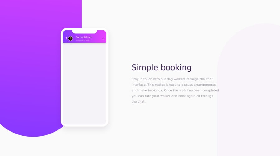
All animations done with Sass. Would've been much easier and cleaner with JS, but I had to do it the hard way. Leave a feedback, I will be happy to hear your opinion! upd.alignment update
Community feedback
- @csimomelianPosted almost 4 years ago
The animations are great.
I would try to avoid using pixel units in favor of rem or em so that it can be more scalable and accessible.
The text bubbles instead of setting fixed width would be more convenient to use maximum width.
Rest, good job
0
Please log in to post a comment
Log in with GitHubJoin our Discord community
Join thousands of Frontend Mentor community members taking the challenges, sharing resources, helping each other, and chatting about all things front-end!
Join our Discord
