

Design comparison

Solution retrospective
how to make this website as responsive? or how to improve it further
Community feedback
- @VCaramesPosted about 2 years ago
Hey @Pradeepsv2004, some suggestions to improve you code:
- Implement a Mobile First approach 📱 > 🖥
With mobile devices being the predominant way that people view websites/content. It is more crucial than ever to ensure that your website/content looks presentable on all mobile devices. To achieve this, you start building your website/content for smaller screen first and then adjust your content for larger screens.
- To center you content to your page, add the following to your Body Element:
body { min-height: 100vh; display: grid; place-content: center ; }-
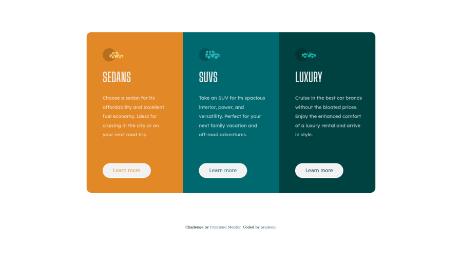
The car images/icons serve no other purpose than to be decorative; They add no value. Their Alt Tag should left blank and have an aria-hidden=“true” to hides it from assistive technology.
-
The headings are being use incorrectly. For this challenge, each heading is equally as important. So best option, is to use <h2> Heading, because it will give each card the same level of importance and it's reusable.
-
Your "buttons" were created with the incorrect element. When the user clicks on the button they should directed to a different part of you site. The Anchor Tag will achieve this.
Happy Coding! 👻🎃
Marked as helpful1@pradeep0712Posted about 2 years ago@vcarames thankyou so much for your feedback. i will make sure to add this in my next project.
0

Please log in to post a comment
Log in with GitHubJoin our Discord community
Join thousands of Frontend Mentor community members taking the challenges, sharing resources, helping each other, and chatting about all things front-end!
Join our Discord