

Design comparison

Solution retrospective
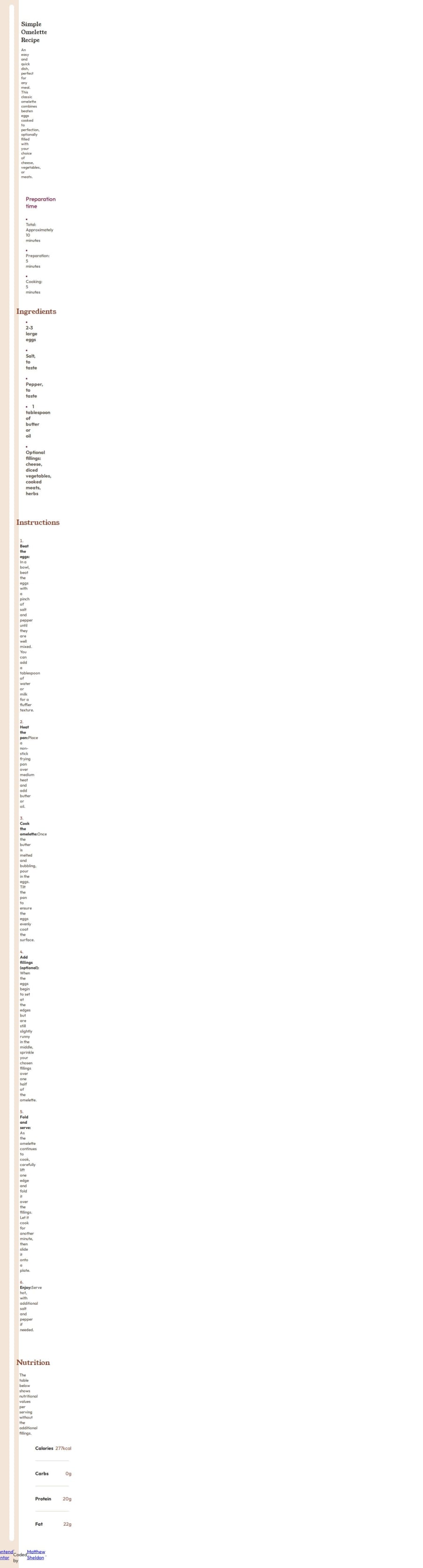
I completed this recipe page which was my perfect design and wasn't hard to complete. I am looking forward to designing more challenges to further improve my skills.
What challenges did you encounter, and how did you overcome them?Some of the challenges I encountered included aligning the recipe image in the center and centering the elements of the table in the center. But I was able to complete the challenge bu the use of chatgpt.
What specific areas of your project would you like help with?I would like help with the div layouts so that I can build projects that are of good quality.Feedback are welcomed.
Community feedback
- P@OdiestaPosted 3 months ago
Hi Matthew Sheldon, Great job on completing the challenge. The content aligned exactly in the center. Except in big desktop resolution the style looks broken. It probably caused by absolute position in container class and body. I have something that i want to mention, which might help improve your code:
- Flex don't need to have grid-template-columns property because it's not a grid.
- On products width it's better to use
max-widthset to some value in px, em, rem. so it can resize responsively on mobile and don't stretch too wide on big screen.
- Try setting the display in Nutrition section to grid and set 2 columns evenly
Marked as helpful0

Please log in to post a comment
Log in with GitHubJoin our Discord community
Join thousands of Frontend Mentor community members taking the challenges, sharing resources, helping each other, and chatting about all things front-end!
Join our Discord