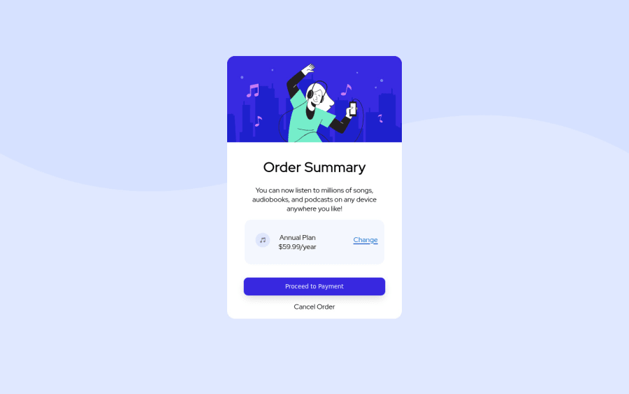


Design comparison
SolutionDesign

Solution retrospective
how can i improve this further? how to make it as responsive btw?
Community feedback
- @EseAlliPosted about 2 years ago
Hi, awesome work. Here are some things I think you can add to your solution
- try adding font-weight to these texts - Annual Price, Change, Proceed to Payment, and Cancel
- Change the color of some of the text to match that od the design.
1 - @danielargolo-gitPosted about 2 years ago
Hey, the icon and tittle addition was a good detail! Keep going the good work!
Adding to what @EseAlli said:
- The button lacks a 'cursor: pointer;' property which plays a huge part for ux.
- The lack of variables called my attention since it would turn difficult to someone or even yourself to copy this project's style in the future if you had to search for the values you used through the files(considering if this wasn't a programmed practice project).
Please feel free to give me feedbacks on my own solution :)
0


Please log in to post a comment
Log in with GitHubJoin our Discord community
Join thousands of Frontend Mentor community members taking the challenges, sharing resources, helping each other, and chatting about all things front-end!
Join our Discord