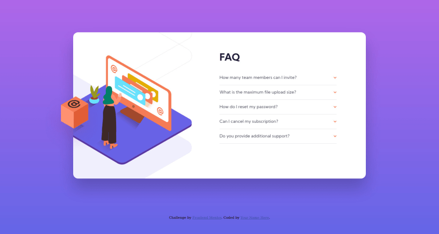
Design comparison
Solution retrospective
I've managed to hack a checkbox to use it for a dropdown menu instead of using javascript. It took me a lot of time as the positioning of a complex set of svg images was new to me. Looking for feedback on where I can improve. Thank You!
Community feedback
- @dwhensonPosted over 3 years ago
Hey @nilanshu96! great work on this one š looks great!
There's actually no need to hack a checkbox in this case as you can actually use the
details
andsummary
element.That will also address this issues outlined by Agata above as it's automatically accessible. It would also solve some of the HTML validation issues as there would be less need to nest block element inside the
label
.See here: https://developer.mozilla.org/en-US/docs/Web/HTML/Element/details
You can also style it, here are some suggestions on how to style it: https://alligator.io/html/details-summary-elements/ You can also add some animation to smooth the opening of the panels.
Hope this helps a bit!
Cheers š
1@nilanshu96Posted over 3 years agoThanks a lot! This is far better than what I pieced together. I didn't even know this existed before. There's always something new to learn after every challenge here.
0 - @AgataLiberskaPosted over 3 years ago
Hi @nilanshu96! Nice work on this challenge. Visually everything is looking great, but the accordions are no accessible - although you can toggle accordions using keyboard, you can't really see where you are. You could easily improve this by adding some styles to label when input is in focus
input:focus + label
. Of course then there is a question of what is standard practice for accordions (how users expect to be able to interact with them) but I don't really feel competent enough to be the judge here.Also, make sure to check the report above - make sure to include alt tag for all images in your html. If images don't add to the content and you don't want them to be read out by screen readers, just add an empty string
alt=""
Hope this helps.
1@nilanshu96Posted over 3 years agoThanks for the feedback! I was actually trying to find some info on what to show when navigating using the tab key but I didn't find anything proper. I'll improvise it more based on your suggestion. Also I thought images that are meant for decoration didn't need an alt so I left it empty.
0
Please log in to post a comment
Log in with GitHubJoin our Discord community
Join thousands of Frontend Mentor community members taking the challenges, sharing resources, helping each other, and chatting about all things front-end!
Join our Discord