Design comparison
SolutionDesign
Solution retrospective
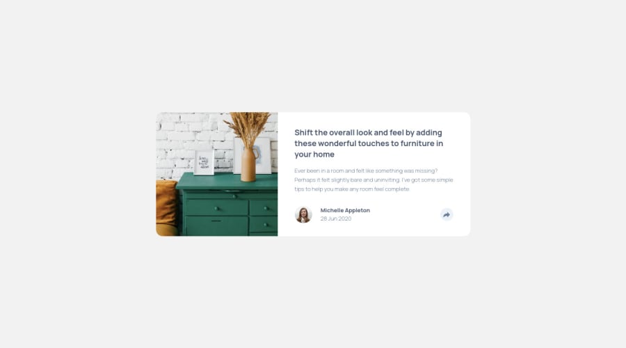
I had a lot of trouble with the animations. Kind of does the job, but I'm sure that there is a cleaner way to do it. Your feedback will be of much help. Thanks!
Community feedback
Please log in to post a comment
Log in with GitHubJoin our Discord community
Join thousands of Frontend Mentor community members taking the challenges, sharing resources, helping each other, and chatting about all things front-end!
Join our Discord
