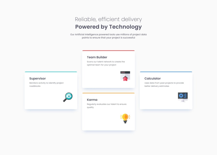
Design comparison
SolutionDesign
Community feedback
- @MateuszZalewPosted 8 months ago
Hey, good job with the solution! Some tips from me:
- you can add semantic html elements like
<header>,<main>for better accessibility - I think heading on top of the page should be an
<h1>, you could also style it to match the design by applying lowerfont-weightto the top text (Reliable, efficient delivery) and wrapping the lower part (Powered by Technology) with biggerfont-weight - icons inside of the cards are positioned higher in your solution than on the design. You used
positionwhich isn't desirable in this case. I would addmargin-bottomto the paragraph to push the icon down and then addmargin-left: autoto align the icon to the right side of the card.
Overall you did a great job😉! Hope my tips will help you.
Good luck!
Marked as helpful0 - you can add semantic html elements like
Please log in to post a comment
Log in with GitHubJoin our Discord community
Join thousands of Frontend Mentor community members taking the challenges, sharing resources, helping each other, and chatting about all things front-end!
Join our Discord
