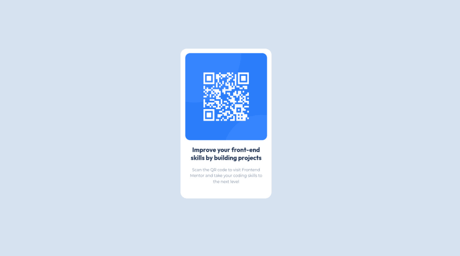
Design comparison
SolutionDesign
Community feedback
- @correlucasPosted over 2 years ago
👾Hello Aws, congratulations for your first solution and 😎 welcome to the Frontend Mentor Coding Community!
Heres my tips for you to make the container and the image responsive and some code fixes:
Align and manage the content using `flexbox.
To make the image responsive and scale with the container remove the margins and add
display: blockandmax-width: 100%you'll see the difference:.intro-div { background-color: white; border-radius: 20px; max-width: 320px; /* width: 22%; */ padding: 20px; /* height: 65%; */ text-align: center; position: absolute; top: 20%; left: 43%; } .qr-img { max-width: 100%; /* width: 90%; */ /* height: 58%; */ postion: relativ; /* max-width: 1440px; */ /* border-radius: 15px; */ /* margin-top: 1vw; */ /* margin-bottom: 0.7vw; */ /* padding: 10px; */ display: block; }👋 I hope this helps you and happy coding!
1
Please log in to post a comment
Log in with GitHubJoin our Discord community
Join thousands of Frontend Mentor community members taking the challenges, sharing resources, helping each other, and chatting about all things front-end!
Join our Discord
