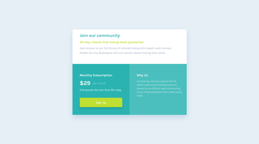
Design comparison
SolutionDesign
Solution retrospective
Good day everyone! I have completed this challenge. I have used figma design for the first time. Any suggestions and feedbacks are very welcomed!
Happy coding!
Community feedback
- @vanzasetiaPosted almost 2 years ago
Hi, Shaxboz! 👋
Here are some suggestions for improvements.
- Make the "Monthly Subscription" and "Why Us" as
<h2>
to give the page some structure. - The content below the "Why Us" text should be a list of bullet points instead of a paragraph element.
- Remove
width
andheight
from the<body>
. It should always fill the entire page. Treat it as the main element of the web page. - Use flexbox to make the card in the middle of the page instead of using absolute positioning.
- The card only needs a
max-width
to prevent it from becoming too large. Removewidth
andheight
from the.group5
styling. As for the height of it, let the content controls the height. - Don't use absolute positioning. You don't need absolute positioning to complete this challenge.
- Never use the
px
unit for font sizes. Userem
orem
instead. Relative units such asrem
andem
can adapt when the users change the browser's font size setting. - Prefer unitless numbers for line-height values to avoid unexpected results. Learn more — line-height - CSS: Cascading Style Sheets | MDN
I am guessing that you are copy-pasting the CSS code from Figma. If that's the case, you should not do that. You should write your own CSS.
I hope my feedback helps. 🙂
Marked as helpful1@shakhboz-shukhratPosted almost 2 years ago@vanzasetia I have copy pasted the design from figma.
I will try to improve it!!!
1 - Make the "Monthly Subscription" and "Why Us" as
Please log in to post a comment
Log in with GitHubJoin our Discord community
Join thousands of Frontend Mentor community members taking the challenges, sharing resources, helping each other, and chatting about all things front-end!
Join our Discord