Design comparison
Solution retrospective
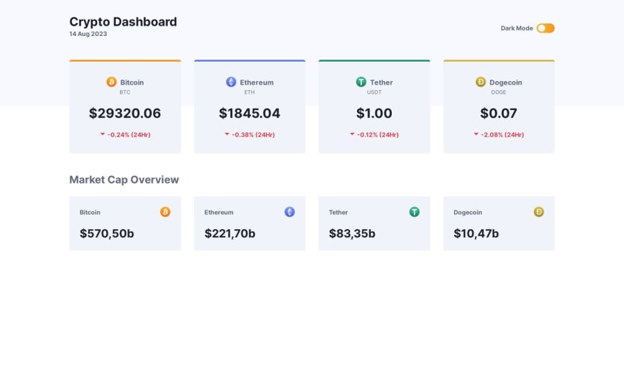
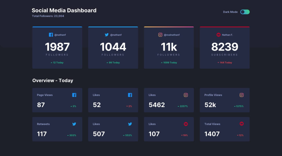
Hi all! So first of all I've taken the social media dashboard challenge and decided to use it as a design base for a totally different idea: this Crypto Dashboard! Mainly because I wanted to utilize a actual Rest API from somewhere. I ended up choosing Coincap API for this project.
Second: I decided to implement the brand new CSS native nesting for the first time, as it's now supported by all major browsers! So please note: if the styling seems to break on your end, it's definitely time to update your browser...
All features in my project/version:
- Active data fetch from live Rest API
- CSS native nesting
- Color theme toggle
- Current date from JS date-time object
- A bunch of Math functions to properly format the incoming number data.
Conclusion / Learnings: I had a great time converting this challenge to my own idea. Working with the live rates data was very challenging, especially formatting it properly and make some styling respond to positive/negative values. CSS native nesting is truly awesome and I'm very happy it has full browser support now. Although I'd actually set-up the project in SASS, I soon realized it is kind of a pain to realize color modes with SASS.. This works way better in CSS because of the fact root variables can be switched around, and this is not possible with SASS. If anybody has a great solution on achieving color modes in SASS, I'd really like to hear your solutions :)
Community feedback
Please log in to post a comment
Log in with GitHubJoin our Discord community
Join thousands of Frontend Mentor community members taking the challenges, sharing resources, helping each other, and chatting about all things front-end!
Join our Discord
