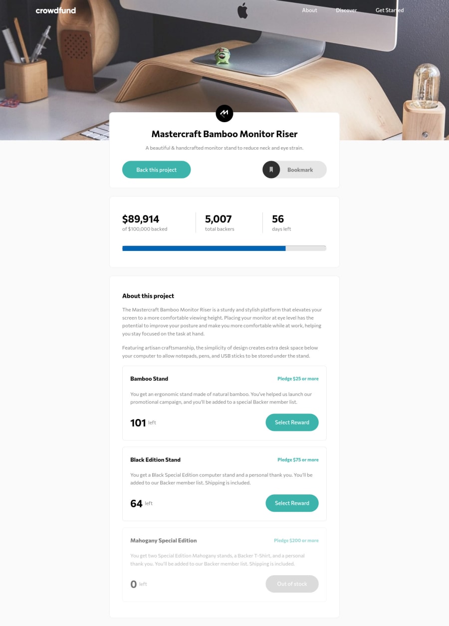
Crowfunding landing page with functional js, scss and BEM!!!!
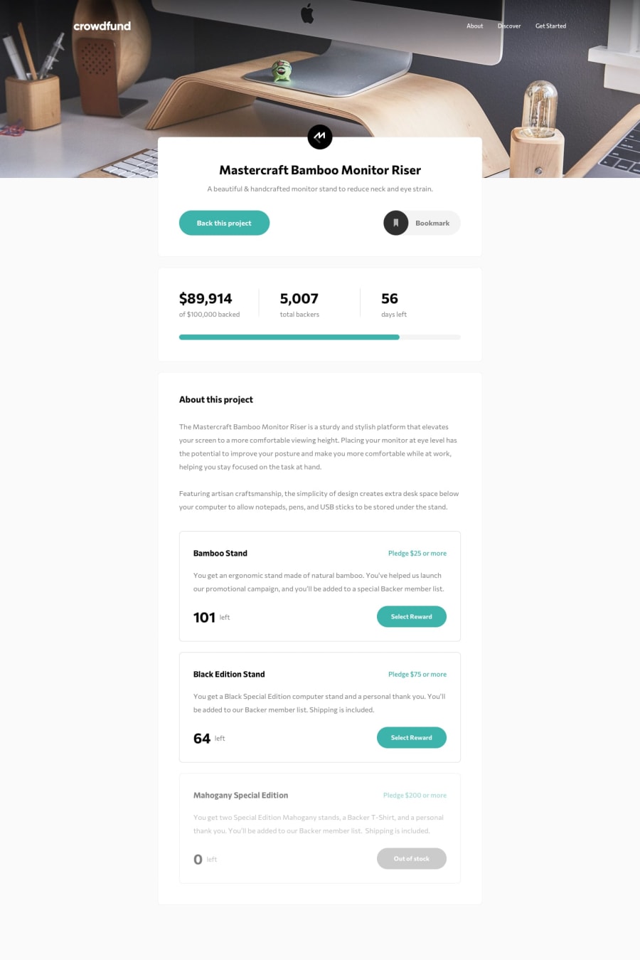
Design comparison
Solution retrospective
Hey guys!
This was a good one, the javascript part of the project to make everything interactive was hard, I need to admit! In the middle of the project, I switched from objected-oriented with classes to functional programming with pure functions. I clearly used the wrong programming pattern at the beginning, I'm not gonna use POO on something like this again.
I'm still testing everything to make sure that everything works properly and there are no issues or bugs. So if you guys found a bug, please make sure to report it!
But overall, I did a pretty good job with js. Probably I'm going to refactor a few things in the future but for now, I'm ok with the result.
Community feedback
- @ApplePieGiraffePosted over 3 years ago
Greetings, Karim! 👋
Good job on this challenge! 👏 Your solution looks good, is responsive, and works rather well! 👍 I like how you styled the scroll bar in the modal that pops up! 😀
I only suggest allowing users to select a backing option from modal by clicking on the entire option (or at least the heading of the option), not just the radio button itself (that'll make it easier for users to select an item). 🙂
Oh, yeah, and adding a favicon to your site would be a nice touch! 😉
Keep coding (and happy coding, too)! 😁
1@yasssuzPosted over 3 years ago@ApplePieGiraffe hey!
thank you for your feedback, I'm gonna fix the backing option.
Happy coding :)
0 - @pikapikamartPosted over 3 years ago
Hey, great job on this one.
In terms of layout, the desktop is good and the mobile state as well.
Suggestion for the UI will be;
-
At mobile state, adding
z-indexon yourmenu-bgwill be awesome so that it will overlap the bookmark button like it should do. Right now, when you click the menu bar, the bookmark button is still clickable and it should be hidden like that right. So adding thatz-indexwill be awesome. Maybe like 10. -
Adding a focus state on the different interactive elements will be really beneficial. Adding those supports more accessibility since a user will know where they are currently, especially when they are using keyboards. As of now, the sites lacks some of those, but the weird thing is the "out of stock" button have that focus state, which should not since it is disabled right.
-
I suggest not using
height: 100vhon a main component or holder. Youcontainerselector is currently using that. So what happens is that it will only take the remaining size based on the viewport's height. So when you inspected it in dev tools at the bottom, it gets pushed on to the top and resizes it, which is not really ideal. Maybe using another units likeremwill be awesome, so that it won't scale relative to the viewport.
For the markup
-
I see that you are using
atags on those supposed buttons. So when everytime user clicks on it, it somehow redirects the user onto the same page since it is a link right. It will be better if you use.preventDefaultmethods on those element in your js. Or much preferably, usebuttonelements. -
Your modal as well is using
atags instead of buttons or having.preventDefault. So when a user, I, click on continue, it refreshes the website. Chaning some behaviors will be really awesome
Overall, great job on this one^^
1 -
Please log in to post a comment
Log in with GitHubJoin our Discord community
Join thousands of Frontend Mentor community members taking the challenges, sharing resources, helping each other, and chatting about all things front-end!
Join our Discord
