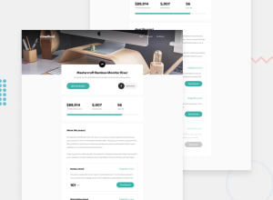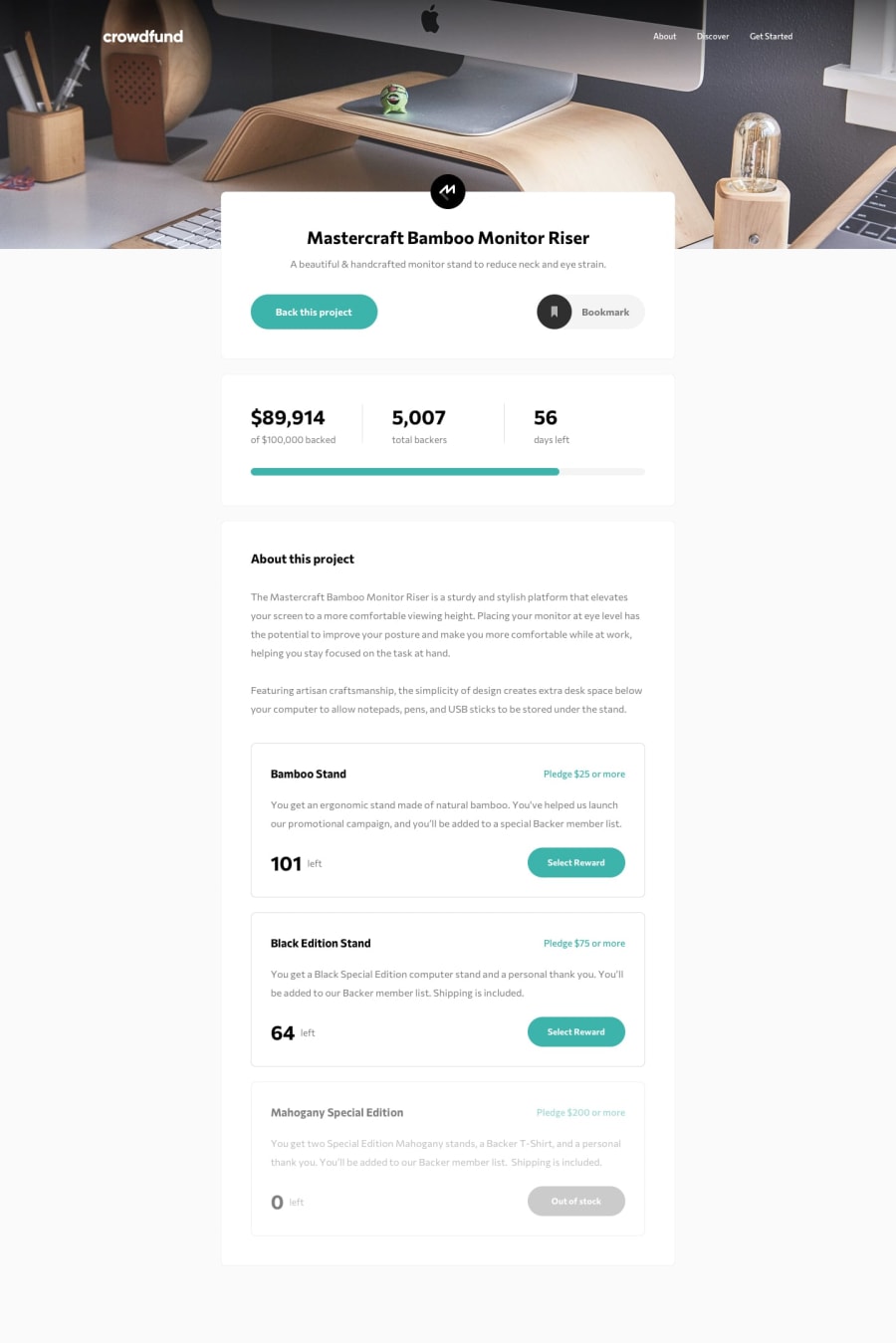
Design comparison
Solution retrospective
This one was too hard compare to the other junior level challenges.
So far, I've only managed to build desktop version .
gotta working on full responsiveness later.
Any feedbacks are highly appreciated!
Community feedback
- @ApplePieGiraffePosted almost 4 years ago
Hi, Jay! 👋
Good work on this challenge! 👍 I really like the hover states of the navigation links in the header of the page! 😀 The smooth transitions on other elements of the page are a nice touch, too! 👏
I just suggest making sure that users pledge the minimum amount required in order to order a product before showing the success modal. 😉
Keep coding (and happy coding, too)! 😁
3@JunjiequanPosted almost 4 years agohi, @ApplePieGiraffe
Thanks for pointing out that issue. I will look into it.
happy coding :)
0
Please log in to post a comment
Log in with GitHubJoin our Discord community
Join thousands of Frontend Mentor community members taking the challenges, sharing resources, helping each other, and chatting about all things front-end!
Join our Discord
