Submitted almost 3 years ago
Crowdfunding-Product-Page With React And Styled Components
@ljcutts
Design comparison
SolutionDesign
Solution retrospective
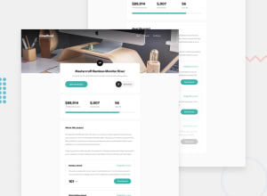
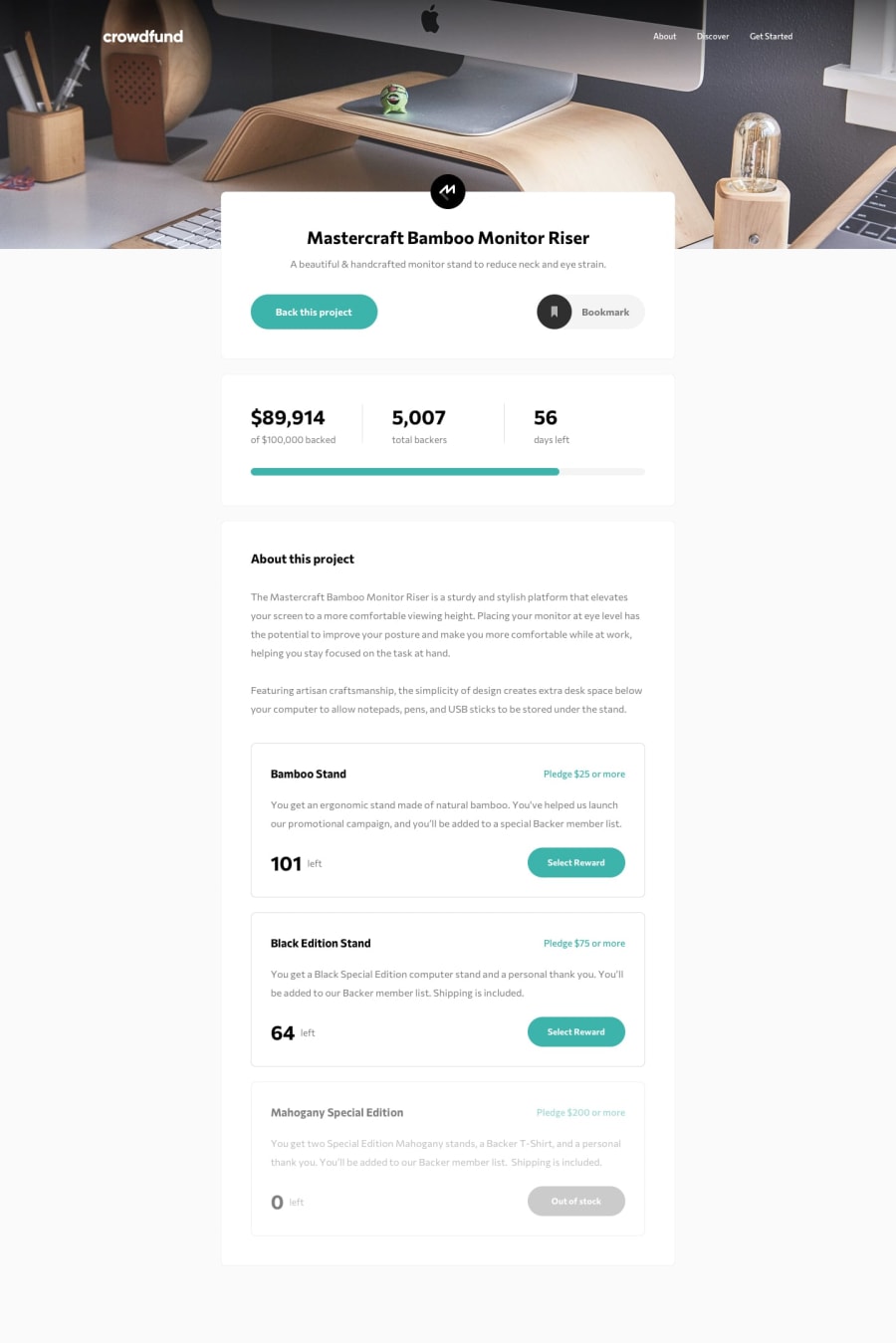
App looks pretty good for the most part. First time using React and styled components. I kind of feel like I brute forced CSS and maybe it's not good combining regular CSS with styled components CSS??? I also see that my progression bar isn't looking good. I wasn't really able to get the right CSS for the bookmark and had to use the filter property since it's an image. Overall, suggestions for better CSS and how can I make my Javascript functions better because I felt like they could have been better(seems like they were a bit redundant but still worked)?
Community feedback
Please log in to post a comment
Log in with GitHubJoin our Discord community
Join thousands of Frontend Mentor community members taking the challenges, sharing resources, helping each other, and chatting about all things front-end!
Join our Discord
