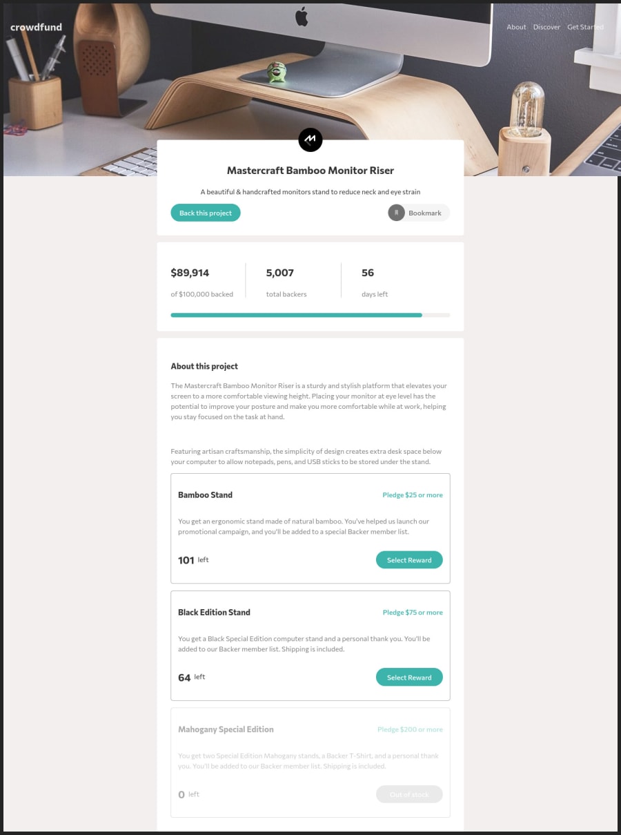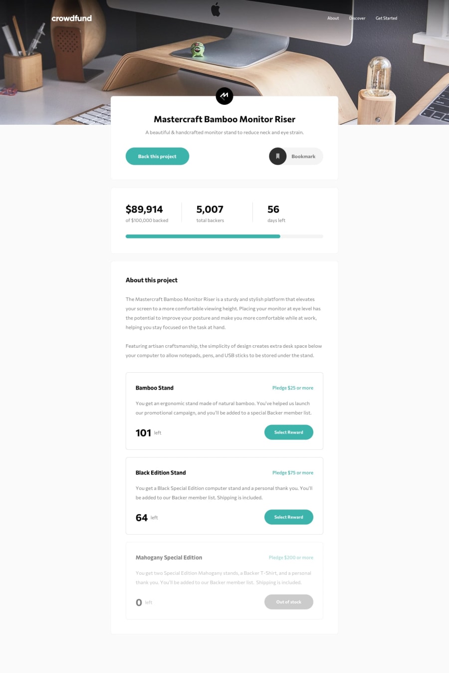
Design comparison
Solution retrospective
This challenge is the most difficult I've ever built so far. I even think that it should be in level 3, or maybe I'm not experienced enough. Anyway, I've learned a lot in this challenge, such as progression bar, modal and a ton of state management. Seriously, I think there should be a better approach regarding state management here, but again due to my mediocre skill, I ended up hard-code state to each product edition. Doing a responsive is also very challenging here, personally I wrote too much css than necessary. Lastly, I didn't do the radio input same as the original design, I plan to learn how to do that later though.
I appreciate any comment and feedback. Thank you!
Community feedback
- @magdanoldePosted over 1 year ago
Hi, congratulation on the project. :) I definitely agree-this one should be in level 3! I am not sure, but I think it is easier to build with vanilla JS though.
I have three small comments:
- If you open the menu and then switch to the desktop view, the mobile version of the menu is still visible.
- In case of the scheme with no reward, you can enter the amount you want to pledge
- In case of two other schemes, there is still possible to pledge less.
I hope it helps!
Cheers, Magda
Marked as helpful0@Nate-eppPosted over 1 year ago@magdanolde Thanks for catching my mistakes here. I truly didn't check about the logic error in the first and the third ones. By the way, I've not found anything wrong about the second one. When I click pledge with no reward, it only shows the continue button for me. Or do you mean something else?
Anyway thanks for your help! Nate :)
0
Please log in to post a comment
Log in with GitHubJoin our Discord community
Join thousands of Frontend Mentor community members taking the challenges, sharing resources, helping each other, and chatting about all things front-end!
Join our Discord
