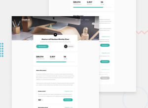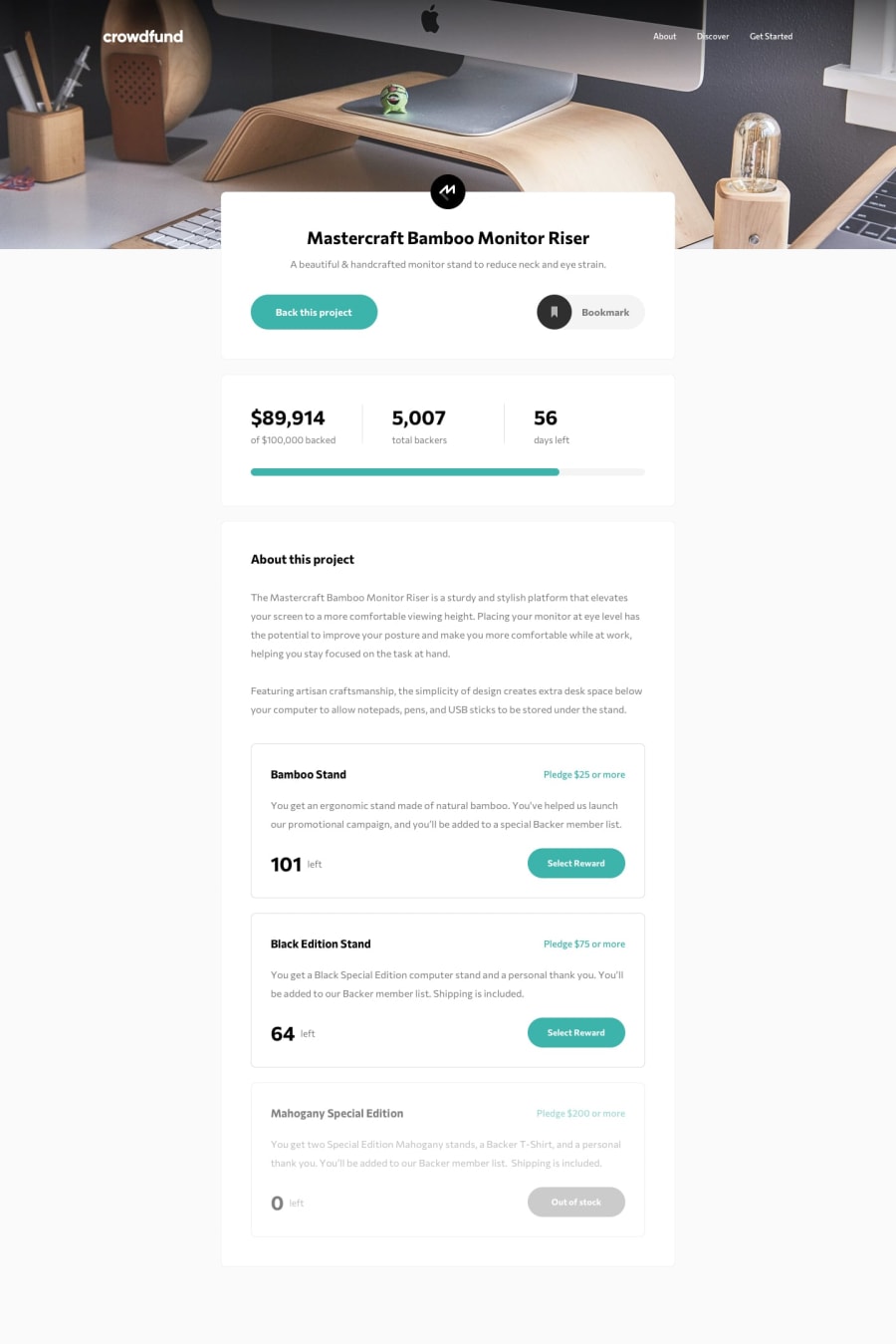
Design comparison
Solution retrospective
A very difficult challenge with a lot of dynamic requirements but I didn’t give up. Great learning challenge
Community feedback
- @pikapikamartPosted over 3 years ago
Hey, really great work on this one. This challenge as well I think is the hardest for me but the most exciting as well.
In terms of layout, desktop I think is fine for now and the mobile state, needs a little bit of tweaking :>
Suggestions would be:
-
Upon loading the website, there is appearance of scrollbar at the bottom. We could remove this via removing
width: 100vwon the#mainselector. -
It will be really great if you used
buttonon the "back this project", becausedivalone will not create an accessible element, but buttons have that. Also your "bookmark" cannot be un-bookmark, you need to check that one out. Also in that, you could make use of "checkbox" and labels, but you need to create some selector using~or+and:focusto give some accessibility features. -
Line-height. Line height is really important, it creates this sort of easy reading feeling for users. Creating some gaps so that you could as a user read text with hassle and not conflict because of the top and bottom text, being near or almost touching the text between them. Adjusting that will be really awesome.
-
On the modal pop up, I think the design on that needs a little bit more touch right :> I will leave that for you.
4.1. Also when I click the "continue" in the pop, I get the success modal right, but for just a really short time and the website refreshes. Since you are using
formright, abuttondefault issubmit. So it submit when I click "continue" but we do want the site to refresh. You could add an eventlistener ofsubmiton the form. Then use.preventDefaultmethod to prevent the listener from submitting the form that causes that refresh.- I think it will be better if you made the hamburger dropdown take the full width instead of just
width: vw. Taking full width creates consistency, but making sure that paddings is still present okay.
Though it is a lot, refactoring our work is really really important in terms of developing. If you need some guide on structuring it here is my solution which you can take a look at. Made with accessible features and other components.
If you need help on that, just drop your query okay. Overall, great work^
0@sarajlijaPosted over 3 years ago@pikamart Thank you for the tips, especially for resolving the website refresh issue after “continue”. I couldn't solve that.
0 -
Please log in to post a comment
Log in with GitHubJoin our Discord community
Join thousands of Frontend Mentor community members taking the challenges, sharing resources, helping each other, and chatting about all things front-end!
Join our Discord
